Categories
Main

MoMA’s AI Art Gamble: Are We Witnessing Progress or the Slow Death of Artistic Authenticity?

The Acquisition That Broke the Internet (And Probably Should Have)

Let’s talk about what happened in late 2024 when the Museum of Modern Art quietly added AI-assisted works to its permanent collection. I say quietly, but what I really mean is that the announcement landed like a grenade in a china shop, and the shards are still settling. The museum didn’t stage some grand press conference. No ribbon cutting or champagne toast. They simply updated their acquisition records, and suddenly every artist, curator, and hot take machine from here to the Venice Biennale was losing their collective mind.

MoMA's AI Art Gamble: Are We Witnessing Progress or the Slow Death of Artistic Authenticity?
MoMA’s AI Art Gamble: Are We Witnessing Progress or the Slow Death of Artistic Authenticity?

Here’s what fascinates me about this moment: it wasn’t actually surprising. Not really. MoMA had already been flirting with AI legitimacy for years. Refik Anadol’s ‘Unsupervised’ installation pulled over 800,000 visitors through the museum’s doors between 2022 and 2023. Eight hundred thousand people. That’s the kind of number that makes board members sit up straight and start thinking about expansion budgets. So when the acquisition finally happened, it felt less like a bolt from the blue and more like watching a marriage that everyone saw coming finally go official.

Illustration for MoMA's AI Art Gamble: Are We Witnessing Progress or the Slow Death of Artistic Authenticity?
Illustration for MoMA’s AI Art Gamble: Are We Witnessing Progress or the Slow Death of Artistic Authenticity?

What the Data Is Screaming (And What It Isn’t)

Let me lay down the numbers, because they tell an interesting story if you’re willing to listen carefully. The global AI art market hit approximately $1.2 billion in valuation during 2024. That’s real money. Real collectors. Real demand. Projections suggest this doubles by 2027, which means we’re not talking about a passing trend or some boutique corner of the art world. This is becoming infrastructure. Yet simultaneously, a 2025 survey from the College Art Association found that 67 percent of active visual artists believe AI-generated work deserves its own categorical designation in institutional collections. Not rejection. Not outright condemnation. Just separate shelving, essentially. Different labels.

That gap between market momentum and professional artist sentiment tells you something important: we haven’t actually solved the problem that everyone pretends is solved. We’ve just decided to move past it without resolution. That’s not progress. That’s avoidance with momentum.

The Open Letter That Nobody’s Talking About Enough

In 2025, the Artists Rights Alliance AI Statement went public with an open letter signed by over 3,000 artists. Three thousand. That’s not a fringe group. That’s a significant portion of the professional art community saying, in clear terms, that museums need to establish transparent provenance standards for AI works before acquisition. Not after. Not eventually. Before.

Read that carefully. They’re not saying no AI art ever. They’re saying: if you’re going to do this, you need rules. Clear ones. Rules that explain where the training data came from, whether living artists’ work was included without permission, what the algorithmic decision-making process involved. That’s a reasonable ask. It’s also an ask that MoMA appears to have largely sidestepped in pursuit of being first, or being bold, or whatever narrative they’re currently deploying.

The Betrayal Question, Answered Incompletely

So is this a betrayal? Yes and no, and the fact that I can’t give you a cleaner answer is precisely why this debate matters. It’s a betrayal to artists who have spent decades perfecting their craft, competing for gallery representation, fighting for acquisition into major collections, only to watch an algorithm achieve similar institutional validation in a fraction of the time. There’s real sting in that. There’s legitimate grievance. When you’ve sacrificed ten thousand hours to your work, seeing something generated in seconds earn equivalent museum space feels like watching someone hand your life’s work to a vending machine.

But is it a bold leap forward? Maybe also yes. Art institutions have always moved faster than the public wanted them to. Photography wasn’t considered art until it became economically viable and culturally undeniable. Performance art looked like nonsense until it stopped looking like nonsense. The question isn’t whether institutions should adapt to new forms. They should. The question is whether they’re adapting responsibly, with transparency, with genuine consideration for the artists whose labor and innovation built the foundation these AI systems are built upon.

What MoMA Actually Needs to Do Now

Here’s where the institution could go from defending a shaky position to actually earning the authority they’re claiming. They need to implement something resembling the transparency standards the Artists Rights Alliance is demanding. Check MoMA’s Collection Policy on New Media if you want to see what they’re currently working with, and you’ll notice some notable gaps. They need to clearly document which artists’ work was included in training data, whether permissions were obtained, what the decision-making algorithm prioritized. They need to fund research into the labor practices of AI art companies. They need to acquire work from traditional artists at equal rates.

Most importantly, they need to stop pretending this is a simple question with a simple answer. The interesting move isn’t choosing between human art and AI art. The interesting move is getting serious about what institutional responsibility actually looks like when you’re navigating genuinely new territory. That’s harder than just picking a side. That’s probably why it won’t happen as quickly as we’d like.

What’s your read on this? Are you watching this play out and thinking MoMA has finally caught up to where art is heading, or do you see something more troubling in how this decision was made? I’m genuinely interested in where you land, because unlike a lot of cultural arguments, this one has stakes that extend well beyond Twitter discourse.

Categories
Main

The Quiet Revolution Happening in Art Education: How RISD’s 2025 New Curriculum Is Dismantling the Studio Hierarchy

The Foundation Year That Wasn’t

Something significant quietly shifted in American art education this January, and you might have missed it scrolling past the news. The Rhode Island School of Design, one of the most influential art institutions in the country, announced a curriculum overhaul that dismantles something unchallenged for decades: the mandatory foundation year built entirely around learning to draw. Think about that for a moment. For generations, every art student who walked through RISD’s doors—all 2,300 of them—knew they would spend their first year learning to see through graphite and charcoal, building hand-eye coordination through endless still-life studies before they could even dream of touching paint or metal or code.

This wasn’t a tweak to the course catalog. RISD is replacing the whole foundation year with what they’re calling interdisciplinary entry studios. Students now choose from multiple pathways that mix drawing with digital media, material experimentation, conceptual thinking, and collaborative practice from day one. The shift feels quiet because it comes without fanfare, but it’s the kind of institutional change that ripples outward for years, reshaping how thousands of young artists think about what it means to begin.

The Skills Gap That Nobody Talked About Until Now

Here’s what haunted art schools silently for years: students were graduating with extraordinary technical skills and almost zero preparation for the actual business of being an artist. A 2024 study by the National Endowment for the Arts surveyed recent graduates and found something sobering. Two-thirds of them—sixty-seven percent—reported feeling completely unprepared to handle the administrative and business demands of professional art careers. They could render light beautifully. They understood composition in their bones. But they didn’t know how to write a grant proposal, manage studio finances, navigate contracts, or build sustainable income streams.

This gap between artistic mastery and professional literacy became even more visible as the economics of art education began to crack. At Yale School of Art, tuition for the 2025-2026 academic year reached forty-four thousand, five hundred dollars annually. That number hangs in the air like a warning. When you’re spending that much money to study art, the question stops being theoretical. It becomes urgent: am I learning what I actually need to build a life from this? The public conversation about accessibility and student debt in MFA programs wasn’t nostalgic. It was panicked.

The Enrollment Question Nobody Expected

The decline crept in quietly, too. Over the past three years, according to the College Art Association’s 2025 annual report, MFA applications dropped fourteen percent nationally. That might not sound catastrophic until you consider what it means: fewer people are choosing advanced art degrees. The reasons cluster around two fears that feed each other. Career uncertainty. Cost. When you combine skyrocketing tuition with graduates who don’t feel prepared to sustain themselves, young artists start asking uncomfortable questions about whether the degree is worth the debt.

RISD’s new approach feels like an institution listening to this conversation and deciding to respond, not by lowering standards but by rethinking what standards should look like. The College Art Association tracks these trends closely across member institutions, and what’s happening at RISD matters because similar conversations are starting everywhere.

Ecological Literacy as the New Foundation

Here’s where the 2025 curriculum redesign gets genuinely interesting. RISD made the unprecedented decision to integrate ecological literacy as a required strand across every single department. Graphic design students. Sculpture students. Fine art painters. Industrial designers. Fashion majors. Every one of them will now engage explicitly with environmental frameworks, sustainability thinking, and the ecological impact of their practice. This isn’t elective. It’s woven into the foundation itself.

RISD is the first major U.S. art school to mandate environmental frameworks institution-wide, and you can feel the weight of that decision. It’s not a separate course labeled “Art and Ecology” that students check off their requirements. It’s a through-line asking: where does this material come from? Where does it go when I’m finished? What’s my responsibility to the systems that made my art possible? These aren’t comfortable questions, and they shouldn’t be. They dismantle the romantic myth of the artist as isolated genius and replace it with something more honest: the artist as someone embedded in networks of consequence.

Suddenly, understanding supply chains matters as much as understanding chiaroscuro. A student designing a poster needs to think not just about how it communicates but about how it gets produced, distributed, and eventually discarded. The studio hierarchy that always privileged pure visual mastery above everything else begins to flatten.

What This Means for How We Think About Art Training

The old model assumed a certain path: learn the fundamentals through drawing, build technical competency, then gradually expand into broader thinking about meaning and context and the world. RISD’s new curriculum says that expansion should begin before you ever arrive on campus. Ecological thinking isn’t advanced material. It’s foundational. Business literacy isn’t a compromise with artistic purity. It’s part of artistic responsibility. The old hierarchy, where drawing sat at the top of the pyramid and everything else flowed downward, was never as natural as it seemed.

Nothing here requires artists to stop drawing. RISD Academic Programs still include rigorous drawing education. But it’s no longer the gatekeeping requirement, the test you have to pass before you’re allowed to think about anything else. Drawing becomes one language among many, one tool among many, mixed from the beginning into a broader ecosystem of artistic learning that includes making, thinking, questioning, and understanding impact.

If you’ve been watching art education with any attention, you know this moment matters. College Art Association members across the country are already having intense conversations about what RISD’s move means for their own institutions. This isn’t about abandoning excellence. It’s about asking what excellence should include, and who gets to decide. What questions are you sitting with about this shift? I’d love to hear what you think about where art education goes from here.

Categories
Main

Why Pantone’s Mocha Mousse Moment Should Make Artists Uncomfortable

The Machine Turns, and Everyone Follows

In December 2024, Pantone announced Mocha Mousse as its Color of the Year, and within weeks, the art world collectively nodded as if a verdict had been handed down from on high. The company described this warm, indulgent brown as a balm for global uncertainty, a visual respite in turbulent times. By mid-January, Google searches for “brown paint palette art” and “earth tone color theory” had spiked 340 percent in the United States alone. Interior designers began rethinking their palettes. Artists started pulling reference images. Everyone wanted to know: how do I make Mocha Mousse work for me?

Why Pantone's Mocha Mousse Moment Should Make Artists Uncomfortable
Why Pantone’s Mocha Mousse Moment Should Make Artists Uncomfortable

Here is what troubles me about this entire choreography. The color itself is perfectly fine, a sophisticated, genuinely appealing shade with historical precedent and real aesthetic merit. But the mechanism that put it there, the industrial consensus-building that made it feel inevitable, deserves scrutiny. Because what happened in those six weeks was not a grassroots artistic movement. It was the mathematics of influence meeting the psychology of validation.

Pantone’s Color Institute, the division responsible for this annual pronouncement, did not even exist until 2000. The company itself began as a color matching system in 1963, created by Lawrence Herbert to solve a specific practical problem: how to standardize inks for the printing industry. That system, PMS Pantone, was genuinely useful. It gave manufacturers a shared language. But somewhere along the line, the tool became the arbiter, and the arbiter became the taste-maker.

Illustration for Why Pantone's Mocha Mousse Moment Should Make Artists Uncomfortable
Illustration for Why Pantone’s Mocha Mousse Moment Should Make Artists Uncomfortable

The Replacement of Genuine Criticism

Art historian Sasha Archibald made a bracing argument in The Brooklyn Rail Art Criticism this past January. She suggested that Pantone’s annual color selections have functionally replaced actual art critical discourse in shaping consumer aesthetics. Think about that for a moment. Art criticism, the careful, often contentious conversation between writers, curators, and artists about what matters and why, has been gradually outsourced to a corporation’s marketing calendar.

This is not paranoia. It is the observable result of institutional consolidation meeting the attention economy. When a design student opens her laptop to research color theory for a project, she no longer begins with art history texts or museum archives. She begins with Pantone. When an architect sits down with a client to discuss the emotional tenor of a space, Pantone’s language is already there, pre-packaged and validated. The color has come with its own story, its own justification, its own cultural permission slip.

The mechanics are elegant precisely because they are invisible. Pantone does not force adoption. Instead, it creates desire through the promise of understanding. To choose Mocha Mousse is to be part of something larger than yourself, to be aligned with a global consensus about beauty and appropriateness. Designers and artists participate willingly because the alternative, choosing a color and defending it on your own terms, feels riskier and lonelier.

When Standardization Becomes Limitation

A 2024 study published in Color Research and Application examined how standardization systems like Pantone actually shape decisions across industries. In residential design projects specifically, these color matching systems influenced material selections in 74 percent of surveyed projects. That is not 74 percent of designers consciously choosing to use Pantone. That is 74 percent of projects where the existence of standardized color systems, the infrastructure of coordination they provide, shaped the outcome.

Here is what gets lost in that efficiency. The artist working intuitively, mixing pigments until she arrives at something that feels true to her vision but cannot be labeled or coordinated across a supply chain. The designer who chooses a slightly “wrong” color because it speaks to something specific about a particular building in a particular light. The architect who understands that brown is not one thing. It is clay, rust, shadow, leather, tree bark, and each carries a different weight and resonance.

When standardization becomes the baseline expectation, deviation reads as risk rather than vision. Young artists especially internalize this calculus without always realizing it. The message is subtle but persistent: there is a right answer, and it comes from outside yourself. Your eye, your training, your instinct exists to recognize and execute that answer well, not to question it or offer alternatives.

The Seduction of Validation

I want to be honest about why Pantone’s Color of the Year matters so much to so many people, artists included. It offers something genuinely valuable: permission. In a chaotic cultural moment, it says, “This is the color. This is what beauty looks like right now. You can trust this.” That is not nothing. Validation is a real need, and the loneliness of creative work is a real fact.

But here is what concerns me more. The more we accept external validation for our aesthetic choices, the quieter our own eye becomes. I am not arguing for some naive romanticism about pure artistic vision uncorrupted by the market or by institutional influence. That ship sailed centuries ago, if it ever existed at all. What I am arguing for is consciousness about the forces at work.

When you choose a color because Pantone blessed it, you are choosing something different than when you choose a color because you studied Renaissance paintings and noticed how Caravaggio used ochre and umber to create spatial depth, and you want to understand that technique in your own work. The outcomes might look identical. The internal logic is completely different. One is received wisdom. The other is earned knowledge.

What Artists Can Do Instead

The answer is not to reject Mocha Mousse or to pretend that Pantone Color of the Year 2025 does not exist. The color is genuinely lovely, and if it speaks to your work, use it with full confidence. The answer is to develop an equal or greater investment in color choices that cannot be standardized. Spend time in museums looking at how actual painters solved color problems across centuries. Notice the specific brown of a Rembrandt shadow or the ochre in a Cy Twombly background. Ask yourself why those choices feel inevitable in those contexts.

Read color theory not as instruction but as conversation. Study how traditional cultures developed color systems based on available materials and light conditions, how desert regions used different palettes than forests, how northern light demanded different relationships between warm and cool tones than Mediterranean sun. There are many correct answers, not one.

Most importantly, practice trusting your eye over the consensus. Mix colors that are slightly off, that do not have a Pantone number attached. Use them anyway. Let your work sometimes be out of step with the moment. The artists whose work holds up across decades are rarely the ones who captured the aesthetic consensus of their time. They are the ones who saw something before the machinery caught up, or who refused to see what everyone else saw, or who developed such a distinctive relationship with color and form that they made the consensus shift to meet them.

What do you think? Are you conscious about how much institutional color standardization shapes your own aesthetic choices? I would genuinely like to know how other artists navigate this tension between access to shared language and the preservation of individual vision. The conversation matters more than the color.

Categories
Main

Why We Remember Van Gogh’s Sunflowers But Forgot Lois Mailou Jones’ Jazz Age Portraits

The Gallery Wall That Tells Half the Story

Walk into any major art museum and count how many works are by women. In most permanent collections, you’ll find roughly fifteen percent. Now walk into the storage rooms downstairs, where thousands of pieces wait in climate-controlled silence. Here, the percentage jumps dramatically. Maria Helena Vieira da Silva’s geometric abstractions sit next to Amrita Sher-Gil’s Indo-European fusion paintings, while Remedios Varo’s surrealist dreamscapes rest in archival boxes. The math is simple and startling: we’ve been seeing only the tip of a much larger iceberg.

This isn’t about quotas or political correctness. It’s about understanding that our visual culture has been shaped by incomplete information. When we only see half the conversation, we miss the full picture of how art movements actually developed, who influenced whom, and what techniques were really breakthrough versus derivative.

The Cross-Pollination We Never Learned About

Consider Hilma af Klint’s abstract paintings from 1906. She was creating geometric, color-theory based abstractions years before Kandinsky painted his famous “first” abstract work in 1910. But while Kandinsky exhibited and theorized publicly, af Klint kept her most radical work private, following spiritual guidance that told her the world wasn’t ready. Her paintings reveal that abstraction didn’t emerge from a single male genius but from a broader cultural shift that multiple artists were navigating simultaneously.

The same pattern appears everywhere once you start looking. Louise Bourgeois was exploring psychological sculpture and installation work in the 1940s, decades before it became an accepted art form. Her spider sculptures weren’t just personal therapy made manifest. They were formal innovations in how three-dimensional art could embody emotional states. Yet art history textbooks still position her as a late-career discovery rather than a lifelong innovator.

These aren’t isolated cases of individual talent being overlooked. They represent systematic gaps in how we’ve constructed our understanding of artistic development. When you remove key players from the story, you get a distorted view of cause and effect, influence and innovation.

The Technical Innovations Hidden in Plain Sight

Artemisia Gentileschi didn’t just paint dramatic biblical scenes. She revolutionized how light could create psychological intensity. Look at her “Judith Slaying Holofernes” next to Caravaggio’s version of the same subject. Caravaggio uses light to create drama through contrast, but Gentileschi uses it to reveal character. The way light catches Judith’s concentrated expression tells us everything about her determination. This wasn’t just different subject matter. It was a different approach to how painting could function as psychological investigation.

Jump forward to the twentieth century and you’ll find similar technical innovation being overlooked. Anni Albers transformed weaving from craft to fine art by treating thread like brushstrokes and loom patterns like compositional studies. Her textile work from the 1930s explores geometric relationships and color interaction with the same rigor as any Bauhaus painting, but because it used fiber instead of paint, it was categorized as decorative art rather than serious artistic investigation.

Even when women artists worked in traditionally accepted mediums, their innovations were often absorbed into the broader movement without proper attribution. Helen Frankenthaler’s soak-stain technique fundamentally changed how paint could interact with canvas, influencing an entire generation of color field painters. Yet her breakthrough is often discussed as a footnote to Abstract Expressionism rather than as one of its defining innovations.

The Alternative Networks That Sustained Art Making

While male artists had access to official academies and exhibition systems, many women artists created parallel networks that were just as sophisticated but less visible. The Bloomsbury Group wasn’t just a literary circle. It was an art economy where Vanessa Bell and Duncan Grant could experiment with Post-Impressionist techniques while maintaining financial independence through decorative arts commissions.

These alternative systems often produced more experimental work precisely because they operated outside traditional market pressures. Georgia O’Keeffe’s flower paintings weren’t just personal expression. They were radical experiments in how abstraction could emerge from close observation of natural forms. Working outside the masculine world of urban galleries allowed her to develop a visual language that challenged both representation and abstraction.

In Mexico, Frida Kahlo’s work emerged from a network of politically engaged artists who saw art-making as inseparable from social transformation. Her self-portraits weren’t narcissistic exercises but investigations into how personal identity intersects with cultural identity. This approach to art as social investigation influenced how surrealism developed in Latin America, creating a more politically engaged version of the movement.

The Ripple Effects We’re Still Discovering

Understanding these overlooked contributions changes how we read art history. When you recognize that Lois Mailou Jones was painting Harlem Renaissance portraits that captured both individual psychology and broader cultural identity, you see that American modernism wasn’t just about formal innovation. It was also about artists finding ways to represent previously invisible communities and experiences.

Contemporary artists have been quietly recovering these influences for decades. Kara Walker’s silhouettes build directly on the work of artists like Elizabeth Catlett, who used printmaking to explore racial identity in the 1940s. Kerry James Marshall’s approach to representing Black subjects draws from Augusta Savage’s sculptures and Romare Bearden’s collages. The influence flows both ways: rediscovering historical women artists changes how we understand contemporary work, while contemporary artists help us recognize innovations we previously missed.

This isn’t about replacing one canon with another. It’s about understanding that artistic innovation has always been more collaborative and diverse than traditional narratives suggest. When you see af Klint’s abstractions next to Kandinsky’s, you don’t diminish Kandinsky. You get a richer understanding of how abstraction actually emerged from multiple sources and experiments.

The next time you visit a museum, try this: look at any major art movement and ask who else might have been working through similar problems at the same time. What conversations were happening that we’re only hearing one side of? What techniques were being developed in parallel that might change how we understand artistic influence? The answers might surprise you, and they’ll definitely change how you see the art hanging on the walls.

Categories
Main

When Algorithms Meet Auction Houses: Why Traditional Collectors Are Missing the Renaissance Happening Right in Front of Them

The Numbers That Made Gallery Owners Choke on Their Champagne

Picture this: you’re standing in Christie’s main salesroom watching a digital artwork flicker across the massive screen, and the bidding has just crossed forty-seven million dollars. The piece was created not by human hands grinding pigment in a Florence studio, but by an AI collective called Obvious using their latest GPT-Vision model. This isn’t science fiction anymore. It happened in February 2026, and the art world is still reeling.

The change has been ridiculously fast. Christie’s Contemporary Art Market Report 2025 revealed that AI-generated works now represent nearly a quarter of their contemporary art sales, jumping from a mere two percent just two years ago. Meanwhile, Dr. Sarah Chen’s research at Artprice tracked a 340% surge in AI art valuations between 2024 and 2025. These aren’t gentle market adjustments. They’re tectonic shifts that have left traditional collectors scrambling to understand what’s happening to their carefully curated world.

The panic makes more sense when you consider that conventional art sales simultaneously dropped twelve percent during this same period, according to the Art Basel Global Art Market Report 2025. For collectors who’ve spent decades learning to distinguish between a genuine Basquiat and a skilled reproduction, watching algorithms command millions feels like watching their expertise evaporate in real time.

When Museums Become Battlegrounds: The Tate Modern Controversy

The institutional art world faced its own reckoning when the Tate Modern announced their acquisition of three AI pieces for their permanent collection. The response was swift and fierce. 127 established artists signed an open letter published in The Guardian, their collective outrage spilling across social media like paint from an overturned palette. Reading their arguments, you can almost hear the echoes of similar protests from art history: the Impressionists being rejected by the Paris Salon, photography being dismissed as mere mechanical reproduction, or abstract expressionism being ridiculed as child’s play.

What these protesting artists understand is that institutional validation carries enormous weight in determining what counts as “real” art. When a museum with the Tate Modern’s prestige places AI creations alongside Picassos and Pollocks, it’s not just making a curatorial decision. It’s rewriting the definition of artistic value. The fear isn’t just economic; it’s existential. If machines can create works worthy of permanent museum collections, what happens to the romantic notion of the tortured artist channeling divine inspiration through years of dedicated craft?

The False Binary That’s Fracturing the Art World

Here’s where the traditional art establishment is making a fundamental error: they’re treating this as a zero-sum game where AI art’s rise necessarily means human art’s fall. But walk through any major city and you’ll see something different happening entirely. Street murals are incorporating AI-generated elements alongside hand-painted sections, creating hybrid works that blur the boundaries in fascinating ways. Digital artists are using AI as a collaborative tool, much like Renaissance masters used camera obscuras to achieve perfect perspective, or how photographers embraced digital manipulation without abandoning the medium entirely.

The parallel that keeps coming to mind is the invention of photography in the 1830s. Painters initially panicked, convinced that mechanical image-making would render their skills obsolete. Instead, photography liberated painting from the burden of literal representation, pushing artists toward Impressionism, Cubism, and Abstract Expressionism. The camera didn’t kill painting. It forced painting to evolve into something more essentially itself. We’re witnessing a similar liberation today, where AI is pushing human artists to explore territories that only consciousness can navigate: the weight of lived experience, the particular way trauma shapes creative expression, the cultural specificity that emerges from growing up in a particular place and time.

Consider how a traditional oil painter approaches a landscape versus how an AI interprets the same scene. The painter brings decades of muscle memory, personal associations with similar vistas, perhaps memories of their grandmother’s garden that unconsciously influence their color choices. The AI processes millions of landscape images to generate statistical patterns, but it cannot access the specific melancholy of autumn afternoon light filtered through the windows of your childhood home. Both approaches create compelling images, but they emerge from fundamentally different wells of experience.

What Collectors Actually Need to Understand About Value

The collectors panicking about AI art are operating from an outdated model of artistic value. One that prioritizes scarcity and human suffering over conceptual innovation and cultural relevance. They’re clinging to romantic notions of artistic authenticity that were always partially constructed anyway. After all, Renaissance masters ran workshops with multiple assistants, Warhol embraced mechanical reproduction, and Koons hasn’t personally fabricated his sculptures in decades. The idea of the lone genius creating unique objects has always been more marketing mythology than historical reality.

What makes art valuable isn’t just the physical process of its creation, but its ability to capture and communicate something essential about the human condition within its historical moment. AI art that sells for millions isn’t valuable because a machine made it. It’s valuable because it represents a crucial moment in human technological development, when we first created tools capable of mimicking our own creative processes. These pieces are historical documents of unprecedented technological collaboration, and their market prices reflect that significance.

Smart collectors are already adapting, building portfolios that include both traditional and AI-generated works. They recognize that the future art market will likely value diversity of approach over rigid adherence to traditional methods. They understand that owning a significant early AI artwork is like owning a first-edition photography book from the 1840s. Not because the medium is inherently superior, but because it represents a crucial turning point in visual culture.

The Renaissance We’re Actually Living Through

What the panicking traditionalists are missing is that we’re not witnessing the death of human creativity. We’re living through its next great expansion. Just as the printing press democratized literature and oil paints in tubes liberated artists from their studios, AI tools are making sophisticated image creation accessible to people who never learned to draw. This isn’t destroying art; it’s multiplying the number of people who can participate in visual dialogue.

The most exciting developments are happening at the intersections: artists who use AI to generate base compositions they then paint over, sculptors who translate AI-generated forms into physical materials, musicians who collaborate with algorithms to explore harmonic territories they couldn’t reach alone. These hybrid approaches suggest that the future of art isn’t human versus machine, but human with machine. A collaboration that amplifies rather than replaces human creativity.

The traditional collectors who are panicking now will likely look back on this moment with regret, remembering when they could have acquired groundbreaking AI works for relatively modest sums. Those who embrace this technological renaissance, who learn to see AI art not as a threat but as an expansion of creative possibility, will find themselves positioned at the forefront of art history’s next great chapter. The question isn’t whether AI belongs in the art world. It’s already here, commanding eight-figure prices and reshaping institutional collections. The question is whether we’re curious enough to explore what this new collaboration between human intention and machine capability might reveal about creativity itself.

Categories
Main

Why Monet Mixed Mud: What Master Painters Knew About Color That Changed Everything

Why Monet Mixed Mud: What Master Painters Knew About Color That Changed Everything

The Day I Watched a Painting Change Colors

I was standing in front of Monet’s “Rouen Cathedral” series at the Musée d’Orsay when the afternoon light shifted through the gallery windows. Suddenly, the cathedral’s stone facade in the painting seemed to breathe. What had appeared as cool gray limestone moments before now glowed with warm ochre and rose undertones. The security guard noticed my expression and smiled knowingly. “The light changes, the painting changes,” she said in accented English. “Monet, he painted this.”

That moment made something click that I’d been wrestling with for years in my own work and through countless museum visits. The masters weren’t just depicting color, they were orchestrating it. They understood something basic about how colors interact, how they shift and dance together, and how our eyes translate those relationships into emotion and meaning. This wasn’t theoretical knowledge from art school textbooks. This was applied science, learned through mixing countless piles of paint on palettes until intuition replaced calculation.

How Vermeer Made Blue Sing Without Shouting

Johannes Vermeer’s “Girl with a Pearl Earring” hangs in the Mauritshuis, and every visitor gravitates toward that luminous blue headwrap. But here’s what most people miss: Vermeer didn’t make that ultramarine blue pop by using more blue. He made it sing by surrounding it with its complement—subtle warm oranges and yellows in the girl’s skin tones and the pearl itself.

Complementary colors sit opposite each other on the color wheel, and when placed side by side, they intensify each other. Vermeer was working with some of the most expensive pigments available—that blue came from ground lapis lazuli, worth more than gold. He couldn’t afford to waste a single brushstroke. Every placement was calculated for maximum visual impact. The warm undertones in her skin aren’t accidental; they’re strategic. They make that precious blue appear to glow from within.

You can see this same principle at work in Van Gogh’s sunflowers, where orange petals seem to vibrate against blue-violet backgrounds, or in Cézanne’s Mont Sainte-Victoire paintings, where warm earth tones make the mountain’s blue-gray peaks appear to advance and recede at the same time. These weren’t happy accidents. These artists understood that color relationships create visual tension and harmony in equal measure.

The Secret Language of Color Temperature

Turner’s later seascapes look like pure atmosphere captured on canvas, but technique reveals intention. In “Rain, Steam and Speed,” that yellow-white locomotive emerges from a storm of warm grays and cool blues. Turner wasn’t painting what he saw—he was painting what he felt, and he used color temperature as his emotional vocabulary.

Warm colors advance, cool colors recede. This principle governs everything from Renaissance perspective to contemporary abstract painting. When Turner wanted that train to hurtle forward out of the mist, he loaded his brush with warm yellows and oranges. When he wanted the background to dissolve into atmospheric distance, he reached for cool blues and violets. The entire painting pulses with this push and pull between warm and cool.

I’ve spent hours copying Turner’s cloud studies in watercolor, trying to understand how he achieved those subtle gradations from warm gray to cool gray within a single brushstroke. The answer lies in mixing temperature, not just hue. His grays aren’t neutral—they lean warm or cool depending on their role in the composition. A warm gray next to a cool gray reads as entirely different colors, even when they’re nearly identical in value.

Why Rothko’s Reds Require Slow Looking

Mark Rothko’s color field paintings frustrate quick museum visits, but they reward patient observation. Stand in front of “Red Study” for ten minutes, and you’ll begin to see what took me years to understand about color interaction. Those floating rectangles aren’t just red and orange—they’re complex relationships between multiple hues, each affecting how we perceive the others.

Rothko built his colors in layers, allowing undertones to ghost through subsequent applications. That red rectangle might contain traces of purple, yellow, and even green, all working together to create a color that doesn’t exist on any tube of paint. He understood that our eyes mix colors optically, creating sensations that pure pigments cannot achieve alone. The result is color that seems to breathe, to shift as you watch.

This layering technique connects directly to the glazing methods of Northern Renaissance masters. Jan van Eyck built flesh tones through multiple transparent layers—cool undertones, warm overtones, subtle color adjustments that created the illusion of translucent skin. The technical approaches differ, but the understanding remains consistent: complex color relationships require complex color construction.

Building Your Own Color Intuition

Understanding color theory through great paintings isn’t academic exercise—it’s practical knowledge that transforms how you see and create. Start by spending real time with a single painting that uses color relationships effectively. Notice not just the dominant colors, but the subtle notes that support them. That shadow isn’t just gray; it might be purple-gray or yellow-gray, and that choice changes everything about how the painting reads.

Try mixing colors on your own palette without looking at the tube labels. Can you create a gray that feels warm? Can you make yellow appear brighter without adding more yellow? These exercises train your eye to see relationships rather than individual colors. Visit the same painting at different times of day if possible, and notice how changing light conditions reveal different color relationships within the work.

The masters learned color theory through their hands, not their heads. They mixed thousands of gradations, tested countless combinations, built up libraries of color relationships through practice. You can access this same understanding by approaching color as they did—as a craft to be learned through making, not a theory to be memorized through reading.

Categories
Main

Why That Angel’s Broken Wing Might Be the Most Radical Thing in the Chapel

I was standing in front of Caravaggio’s “Saint Matthew and the Angel” when the tour guide confidently announced that the angel’s gentle guidance represented divine inspiration flowing into human creation. The twenty-something art students nodded approvingly, phones already out to capture the “meaning” for their Instagram stories. But here’s what bothered me about that neat little explanation: it completely ignored the angel’s strangely awkward posture, Matthew’s obvious discomfort, and most tellingly, the way Caravaggio painted the angel’s wing with what looks suspiciously like a tear in the feathers.

We’ve been taught to read religious art like a spiritual picture book, where every symbol has a predetermined meaning and every gesture points toward devotion. But what if we’ve been reading it all wrong? What if the most interesting religious artworks aren’t the ones that celebrate faith, but the ones that question it?

Why That Angel's Broken Wing Might Be the Most Radical Thing in the Chapel

The Mythology of Perfect Faith

Walk through any major museum’s medieval wing and you’ll hear the same interpretations repeated like a comforting mantra. The lily means purity, the dove represents the Holy Spirit, the lamb symbolizes Christ’s sacrifice. These readings aren’t wrong, exactly, but they’re incomplete in a way that flattens centuries of complex artistic expression into spiritual greeting cards.

Consider the Annunciation scenes that fill Renaissance galleries. We’re told to see Mary’s blue robes as symbols of heavenly virtue and her downcast eyes as humble acceptance. But look closer at Simone Martini’s version in the Uffizi. Mary isn’t accepting anything with grace. She’s literally pulling away from the angel, her body language screaming reluctance while her face shows something that looks remarkably like fear. The golden background that’s supposed to represent divine glory? It feels more like a prison than paradise when you notice how it boxes in the figures.

This isn’t an accident or artistic incompetence. Martini was painting in 14th-century Siena, where political upheaval and plague made divine intervention feel less like comfort and more like cosmic uncertainty. His Mary reflects the very human experience of being asked to carry an impossible burden, regardless of its supposed honor.

When Saints Look Skeptical

The art establishment loves to present religious paintings as unanimous celebrations of divine order, but spend enough time with these works and you’ll start noticing the cracks in that narrative. Take Francisco de Zurbarán’s paintings of female saints, scattered across museums from Madrid to New York. Art history textbooks describe his Saint Agatha and Saint Casilda as examples of “spiritual ecstasy” and “divine contemplation.”

But look at their eyes. Really look. These women aren’t lost in mystical rapture. They’re staring directly at you with expressions that range from resignation to outright challenge. Zurbarán was painting during the Spanish Counter-Reformation, when the Catholic Church was desperately trying to reassert control over religious narrative. His saints feel less like willing participants in divine drama and more like women who’ve found themselves trapped in someone else’s story about their lives.

The same skeptical undercurrent runs through Georges de La Tour’s candlelit religious scenes. We’re told to read the dramatic chiaroscuro as spiritual illumination breaking through worldly darkness. But notice how often his figures look sideways at the light source rather than toward it. Their faces show contemplation, yes, but it’s the kind of contemplation that asks hard questions rather than accepting easy answers.

The Politics Hiding Behind Halos

Perhaps nowhere is the gap between official interpretation and artistic reality more obvious than in commissioned religious works. When the Medici family funded Botticelli’s religious paintings, we’re supposed to see pure spiritual devotion. What we actually see is a fascinating power struggle played out in paint and gold leaf.

Botticelli’s “Adoration of the Magi” in the Uffizi contains portraits of the entire Medici family cast as wise men and attendants. The official reading presents this as humble wealthy patrons inserting themselves into sacred narrative. But look at the spatial composition. The Medici figures dominate the foreground while the Holy Family gets pushed into an awkward corner arrangement. The supposed wise men are looking at each other and the viewer rather than at the Christ child. This isn’t devotional art. It’s political theater wearing religious costume.

Even more telling are the religious frescoes that decorated private chapels in Renaissance palaces. These weren’t meant for public worship but for the daily viewing of specific powerful families. The symbolism in these works often had more to do with dynastic legitimacy and political alliances than spiritual meaning. Those carefully placed family crests and coded references to contemporary events reveal artists working within religious frameworks to communicate entirely secular messages.

Reading Between the Brushstrokes

The most radical act we can perform as viewers of religious art isn’t to memorize traditional symbol meanings, but to notice where those meanings break down. When you see a painting that supposedly celebrates divine love but feel an undercurrent of melancholy, trust that instinct. When a saint’s expression seems more complicated than the wall text suggests, spend time with that complexity.

Start with the details that don’t fit the official narrative. Why does the angel in that Annunciation look more worried than joyful? What’s happening in the background figures that everyone ignores while focusing on the main religious action? How does the artist’s personal historical context change what we’re seeing?

The beauty of religious art lies not in its ability to confirm predetermined spiritual meanings, but in its capacity to capture the full spectrum of human experience with the divine, including doubt, resistance, and questioning. The artists who created these works were dealing with the same fundamental questions about faith, power, and meaning that we face today. Their paintings become infinitely more interesting when we allow them to ask difficult questions rather than demanding that they provide easy answers.

Next time you encounter religious art, try spending five minutes looking before you read any explanatory text. What do you see when you’re not being told what to see? What questions does the work raise that might be more interesting than the answers it’s supposed to provide?

Categories
Main

The Art of Seeing: How I Built a Collection That Rivals Museum Walls (Without the Museum Budget)

I was standing in my friend Sarah’s kitchen last month when I noticed something extraordinary hanging above her coffee maker. What looked like a simple black and white photograph at first glance turned out to be a gelatin silver print from a local photographer documenting construction workers during the city’s subway expansion in the 1970s. The composition reminded me of Walker Evans’ subway portraits, but with a distinctly contemporary edge in how the photographer captured reflected light on hard hats. Sarah had found it at a neighborhood estate sale for twelve dollars.

This moment sums up what I’ve learned about collecting art on a budget: the most rewarding pieces aren’t necessarily the most expensive ones, but rather those that speak to you across time and context. When you understand how to look—really look—at art, you begin to see connections and value that have nothing to do with price tags and everything to do with visual dialogue between past and present.

The Art of Seeing: How I Built a Collection That Rivals Museum Walls (Without the Museum Budget)

Start Where Artists Actually Begin: Local Art Schools and Graduate Shows

The most undervalued hunting ground for emerging art exists right in your backyard at art school graduate exhibitions. Every spring, MFA students across the country present thesis shows that represent two to three years of intensive development. These artists are at an interesting moment—they’re technically skilled, conceptually developed, and priced for accessibility rather than market speculation.

I discovered this approach when I wandered into a graduate ceramics show at the local university. Among the pieces was a series of vessels that referenced both ancient Greek amphora and contemporary urban architecture. The artist had developed a glazing technique that created the illusion of weathered concrete, making each piece feel like a miniature building facade. The entire series of five vessels cost less than a single designer dinner plate, yet each piece demonstrated the kind of technical mastery and conceptual depth you’d find in museum collections.

When attending these shows, look for artists who demonstrate clear influences while developing their own voice. Ask yourself: does this work engage with art historical precedents in a fresh way? Can you see technical skill combined with personal vision? Graduate students are also more likely to offer payment plans or trades, creating opportunities for relationship-building that can last throughout their careers.

The Print Revolution: Original Art for the Price of a Nice Dinner

Printmaking offers the most accessible entry point into collecting original art, and it’s where some of art history’s greatest masters made their most experimental work. When Picasso wanted to explore new ideas quickly, he turned to etchings and lithographs. When Warhol democratized art collecting, he used silkscreen prints to make owning original work possible for broader audiences.

Contemporary printmakers continue this tradition of innovation and accessibility. I recently acquired a reduction woodcut that demonstrates the remarkable complexity possible in this medium—the artist carved away sections of the same wooden block for each color layer, meaning once the final print was pulled, the block could never reproduce that exact image again. The resulting edition of only fifteen prints cost a fraction of what an original painting would, yet each print represents the same artistic decision-making process and manual skill.

When collecting prints, focus on understanding the different techniques and their implications. A hand-pulled lithograph created in the artist’s studio carries different weight than a digital reproduction. Look for edition sizes, pencil signatures, and documentation of the printing process. Many contemporary artists use printmaking to explore ideas that inform their larger body of work, making prints an intimate window into their creative process.

Online platforms like 20×200 and local print studios often offer affordable original prints from both established and emerging artists. The key is learning to distinguish between mass-produced prints and works where the printing process itself is part of the artistic medium.

Finding Gold in the Secondary Market: Estate Sales, Auctions, and Consignment

The secondary art market operates on inefficiencies that benefit knowledgeable collectors. Estate sales, in particular, often undervalue art because the pricing is handled by liquidation companies rather than art specialists. I’ve found everything from mid-century modern ceramics to folk art paintings that deserved spots in regional museum collections.

The secret lies in developing pattern recognition. When I spot a painting with confident brushwork, unusual color relationships, or compelling composition, I research the signature and style regardless of the sale context. Last year, I discovered a small oil painting by a regionalist artist whose work hangs in the Whitney Museum. The estate sale had it priced as “decorative art” for forty dollars, but understanding the artist’s place in American art history revealed its true significance.

Online auction platforms like LiveAuctioneers aggregate estate sales nationwide, allowing you to research and bid remotely. The key is setting strict budgets and focusing on work that speaks to you personally rather than chasing perceived investment value. Some of my most treasured pieces came from unexpected sources—a regional auction house that specialized in furniture but occasionally featured art from local estates.

Consignment shops near universities and cultural districts also yield surprising discoveries. Gallery owners and collectors sometimes consign work to raise funds quickly, creating opportunities for pieces that would otherwise remain in private collections or expensive galleries.

Building Relationships: The Long Game of Art Collecting

The most sustainable approach to collecting involves building genuine relationships with artists, gallery owners, and fellow collectors. When you demonstrate real interest in an artist’s work and career development, you often gain access to pieces before they reach higher price points or wider recognition.

I began following a sculptor’s Instagram account after seeing one piece in a group show. Over months of engaging with her process posts and studio visits, I learned about her investigation of how ancient bronze-casting techniques could address contemporary environmental themes. When she offered a small maquette for sale through direct message, a study for a larger public commission, I understood both its technical achievement and conceptual significance. That relationship has led to studio visits, advance notice of new work, and insights into her creative process that enhance my appreciation of the piece daily.

Gallery relationships prove equally valuable. Smaller galleries often work with emerging and mid-career artists whose prices remain accessible. When you become a known presence—attending openings, asking thoughtful questions, occasionally purchasing—gallery staff remember your interests and budget. I’ve received calls about work that never made it to the walls because a gallery director thought it might appeal to my specific collecting focus.

Join local art organizations, attend artist talks, and participate in studio tours. These activities build knowledge while creating natural opportunities to meet artists and discover work before it reaches broader markets. The relationships you develop will prove more valuable than any single acquisition strategy.

What draws you to certain visual experiences in your daily life? Start there, and let that curiosity guide your first steps into collecting. The most meaningful art collections grow organically from genuine visual fascination rather than calculated acquisition strategies.

Categories
Main

Why Van Gogh’s Self-Portraits Tell Different Stories Than His Letters

Standing in front of Van Gogh’s 1889 self-portrait at the Musée d’Orsay, I watched a teenager lean close to the canvas and whisper to her friend, “He looks so sad.” Then she stepped back and tilted her head. “But also kind of angry?” She had stumbled onto something art historians have been parsing for decades: the disconnect between what we see in a painted face and what we know about the person behind it. Van Gogh’s letters from that same period overflow with enthusiasm about his work and hopes for the future, yet his painted eyes seem to bore through the canvas with an intensity that feels almost confrontational.

Portrait paintings are visual autobiographies written in pigment and brushstrokes, but like any autobiography, they’re shaped by what the author chooses to reveal or conceal. The tension between the painted persona and the documented person creates a puzzle that transforms how we read these intimate works.

Why Van Gogh's Self-Portraits Tell Different Stories Than His Letters

The Performance of Self in Painted Form

Every self-portrait is a performance, but not in the theatrical sense we might expect. When Frida Kahlo painted herself wearing a thorn necklace with a dead hummingbird pendant, she wasn’t documenting her actual daily attire. She was constructing a visual language for pain, resilience, and Mexican identity that her diary entries from the same period describe in completely different terms. Her written words focus on Diego, on political frustrations, on the practical details of managing chronic illness. Her painted self speaks in symbols that compress years of experience into a single, unflinching gaze.

This gets even more complex with commissioned portraits. When John Singer Sargent painted Madame X in 1884, the scandal wasn’t just about the provocative dress strap. It was about the gulf between how Virginie Amélie Avegno Gautreau wanted to be seen by Parisian society and how Sargent’s realism revealed her character. His letters describe her as vain and difficult, constantly repositioning herself and demanding changes. But the finished painting captures something else entirely: a woman performing confidence while betraying an underlying vulnerability in the angle of her shoulders and the tension around her eyes.

What Brushstrokes Reveal That Words Cannot

The physical act of painting leaves traces that written records rarely capture. In Lucian Freud’s self-portraits from the 1940s versus those from the 1990s, you can track not just the aging of his face but the evolution of his relationship with paint itself. Early works show careful, almost anxious mark-making, each brushstroke considered and controlled. By the time he painted himself in the 1990s, his handling had become aggressive, confident, almost violent in its honesty. His interviews from both periods discuss technique in measured, intellectual terms, but the paint handling tells a different story about his emotional relationship to creating.

Alice Neel’s self-portrait from 1980, painted when she was eighty years old, demonstrates this disconnect beautifully. She sits naked in a striped chair, unflinching in her representation of her aged body. Her correspondence and interviews from that period focus on artistic recognition, on finally receiving the acclaim she deserved. But the painting itself is about something entirely different: a final act of defiance against both artistic convention and social expectations about older women’s bodies. The loose, confident brushwork contradicts any narrative of decline or diminishment.

Reading the Spaces Between Documentation and Representation

Sometimes the most revealing aspect of a portrait is what it deliberately excludes. Giorgio de Chirico’s self-portraits from the 1920s show a man in classical dress, often surrounded by ancient architectural fragments or mysterious objects. His letters and manifestos from the same period are filled with attacks on modern art and passionate defenses of traditional techniques. But the paintings themselves reveal a deep ambivalence about this position. The classical elements feel staged, almost costume-like, and the mysterious objects suggest an ongoing fascination with the very surrealist tendencies he was publicly rejecting.

This gap between public persona and private expression becomes even more pronounced when we consider artists working under political pressure. Käthe Kollwitz’s self-portraits from the 1930s show a woman aging into lines of worry and determination, but her diary entries focus more on day-to-day concerns about her son, her work, her health. The paintings, however, capture something her words couldn’t safely express: the weight of witnessing political upheaval and personal loss. Her face becomes a map of historical experience that her written words, necessarily circumspect, could only hint at.

The Technology of Truth-Telling

Different painting techniques create different relationships between the artist and their image. Chuck Close’s photorealistic self-portraits, built up from thousands of tiny painted marks, create an almost mechanical distance from the emotional immediacy we might expect from self-representation. His interviews describe this methodical approach as a way of managing his prosopagnosia, his difficulty recognizing faces. But the paintings themselves suggest something more complex: a way of seeing himself that’s simultaneously intimate and detached, personal and universal.

Compare this to Jenny Saville’s self-portraits, where thick impasto and aggressive mark-making create an almost sculptural presence on the canvas. Her academic writing discusses the politics of representing the female body, but the paintings themselves are about the physical reality of being embodied, the weight and substance and undeniable presence of flesh. The paint becomes flesh becomes paint in a way that transcends theoretical discussion.

David Hockney’s painted self-portraits from the 1980s, created while he was simultaneously exploring photography and eventually digital media, show an artist grappling with how different technologies shape self-representation. The paintings feel almost nostalgic, a return to traditional methods that his contemporary statements suggested he was moving beyond. Yet they capture something about the experience of being an artist in transition that his more experimental work couldn’t quite achieve.

Next time you encounter a self-portrait, try reading it against whatever you know about the artist’s life, their letters, their public statements. Look for the places where the painted story and the documented story diverge. Those gaps aren’t mistakes or failures of representation. They’re where the real story lives.

Categories
Main

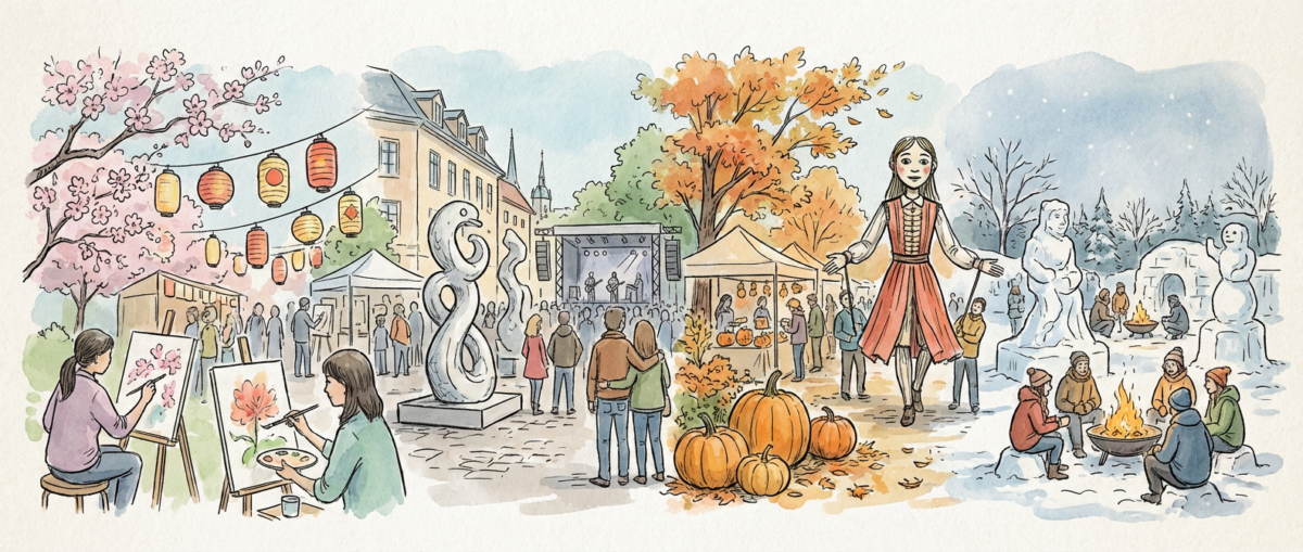
The Sacred Spaces Where Artists Gather: Five Seasonal Festivals That Transform Landscape Into Living Canvas

When Earth Becomes the Ultimate Studio

There’s something profound about watching an artist work directly with the elements. Mud between fingers, wind shifting installations, snow accumulating on sculptures throughout the night. While museums preserve art in climate-controlled sanctuaries, seasonal festivals thrust creativity into direct conversation with weather, terrain, and time itself. These gatherings are more than exhibitions. They’re laboratories where artists push against the constraints of seasons, transforming temporary limitations into permanent inspiration.

The Sacred Spaces Where Artists Gather: Five Seasonal Festivals That Transform Landscape Into Living Canvas

The most compelling seasonal art festivals understand this dance between creation and dissolution. They embrace the fact that winter installations will be buried under spring thaw, that summer sculptures will weather autumn storms. This temporal fragility doesn’t diminish the work, it intensifies every decision, from material selection to structural engineering. Artists working in these contexts develop an intimate knowledge of how cedar responds to humidity differently than oak, how metal contracts in cold morning air, how pigments shift under varying light throughout a single day.

Illustration for The Sacred Spaces Where Artists Gather: Five Seasonal Festivals That Transform Landscape Into Living Canvas

Venice Biennale’s Architecture Exhibition: Where Concrete Dreams Meet Mediterranean Light

The Venice Architecture Biennale, held in odd years from May through November, transforms the Giardini and Arsenale into sprawling laboratories of spatial imagination. But it’s the relationship between these experimental pavilions and Venice’s unique atmospheric conditions that reveals the festival’s true genius. Morning light filtering through the Arsenale’s ancient windows catches dust motes and highlights the texture of raw concrete installations, while afternoon humidity softens the edges of steel frameworks until they seem to dissolve into the surrounding lagoon mist.

What gets me most is watching how architects respond to Venice’s physical constraints. The city’s foundation issues mean heavy materials require innovative engineering solutions. I’ve seen installations that use tensioned cables and counterweights to create the illusion of massive stone structures while actually distributing minimal load. The constant threat of acqua alta forces creators to design with water intrusion in mind. Some pavilions incorporate flooding as an intended design element, with surfaces that reveal hidden patterns when submerged.

The festival’s extended timeline allows for genuine seasonal transformation. September installations look entirely different from their May iterations, weathered by months of salt air and thousands of visitors. Wooden elements develop patina, metal develops oxidation patterns that become part of the aesthetic intention. By November’s closing, many works have evolved far beyond their opening-day appearance, carrying the summer’s memories in their surfaces.

Burning Man’s Temporal Architecture: Engineering for Destruction

Nevada’s Black Rock Desert provides perhaps the most extreme canvas for seasonal art creation. The festival’s late August timing coincides with some of the harshest conditions imaginable. Daytime temperatures exceeding 100 degrees, nighttime drops to near freezing, windstorms that sandblast exposed surfaces with alkali dust. These aren’t obstacles to be overcome but essential collaborators in the creative process.

The engineering required for large-scale installations in this environment is staggering. Artists must calculate wind loads that can exceed 60 mph, design foundations that work in alkaline sand that shifts constantly, and select materials that can withstand temperature swings of 70 degrees within 24 hours. I’ve watched teams spend months testing joint connections, knowing that a single failure could endanger hundreds of participants during the week-long event.

But it’s the temporal nature of Burning Man’s art that pushes creators into entirely new territories. Designing for intentional destruction requires a fundamental shift in material thinking. Traditional preservation concerns become irrelevant, replaced by questions of how structures will burn, what colors flames will produce, how collapse patterns can be choreographed. Artists work with pyrotechnicians to embed controlled demolition into their aesthetic vision, creating works whose moment of destruction becomes their ultimate expression.

Sapporo Snow Festival: Carving Time from Frozen Water

February in Hokkaido presents sculptors with a medium that exists nowhere else. Snow compressed into blocks dense enough to support detailed architectural details, yet ephemeral enough to sublime into nothing within weeks. The Sapporo Snow Festival transforms the city into a showcase of techniques that can only be practiced in specific climatic windows, using tools and methods developed over centuries of working with frozen water.

The technical knowledge required for large-scale snow sculpture astounds me. Teams must understand the crystalline structure of different snow types, how wind direction affects carving stability, the precise temperature ranges where detail work becomes possible or impossible. Traditional Japanese woodworking tools adapt beautifully to snow carving, but the medium demands entirely different approaches to structural integrity and surface finishing.

Watching master carvers work reveals techniques passed down through generations of craftspeople who understood seasonal materials intimately. They read snow conditions like manuscript illuminators once read parchment, feeling for the right moisture content, testing compression levels, anticipating how overnight freezing will affect tomorrow’s carving session. The festival’s timing maximizes these optimal working conditions while ensuring maximum public viewing before spring melt erases months of meticulous work.

Art Basel Miami Beach: Where Humidity Becomes a Medium

December in Miami might seem like the antithesis of challenging seasonal conditions, but the festival’s timing creates unique opportunities for artists working with humidity, salt air, and intense subtropical light. The coastal location means artworks contend with moisture levels that would damage most museum pieces, while the brilliant winter sunshine reveals colors and textures invisible under artificial lighting.

I’m continually amazed by how artists adapt their practices to Miami’s microclimate. Oil painters adjust their medium ratios to account for slower drying times in high humidity. Sculptors working with organic materials discover new possibilities as salt air accelerates certain decay processes while preserving others. Installation artists learn to anticipate how afternoon thunderstorms will interact with their pieces, sometimes incorporating water collection and drainage as aesthetic elements.

The festival’s beach installations particularly demonstrate this environmental collaboration. Artists working on sand must engineer temporary foundations that won’t disrupt turtle nesting while withstanding occasional king tides. Materials selection becomes crucial. Metals that would patinate beautifully inland can corrode destructively in salt spray, while certain plastics develop unexpected optical properties under subtropical UV exposure.

These festivals remind us that art’s relationship with place and time extends far beyond subject matter into the fundamental physics of creation itself. They challenge artists to work as atmospheric scientists, materials engineers, and temporal philosophers simultaneously. Each season brings opportunities for creative exploration that simply cannot be replicated in controlled studio environments, and witnessing these collaborations between human imagination and natural forces continues to reveal new dimensions of what art can become when it engages directly with the world’s magnificent unpredictability.

Categories
Main

The Brushstrokes That Build a Legacy: Essential Watercolor Tools for the Journey Ahead

The Foundation That Outlasts Trends

When I think about the great watercolorists who shaped how we see light and transparency—from Turner’s revolutionary atmospheric studies to Winslow Homer’s maritime masterpieces—I often focus on their genius, their vision, their ability to capture fleeting moments in pigment and water. What I sometimes forget is that each of these artists began with the same fundamental question every watercolor painter faces: which tools will serve my artistic voice for decades to come?

The Brushstrokes That Build a Legacy: Essential Watercolor Tools for the Journey Ahead

The beauty of watercolor lies not in complexity but in the profound relationships between a few simple elements. Unlike oil painting with its endless array of mediums and supports, or sculpture with its specialized tools for each material, watercolor painting asks for restraint, for thoughtful selection. The masters understood this. They built their reputations not on rooms full of equipment, but on intimate knowledge of paper that could hold their vision, brushes that became extensions of their hands, and pigments that would sing in harmony with water.

This restraint becomes a gift to the beginning painter. Where other mediums might overwhelm with options, watercolor offers clarity. The essential tools are few, but each carries weight, each demands understanding, each offers a lifetime of discovery. Think of how Georgia O’Keeffe worked with the same basic watercolor setup for decades, yet continued to find new ways to express the essence of flowers, landscapes, and light.

Illustration for The Brushstrokes That Build a Legacy: Essential Watercolor Tools for the Journey Ahead

Paper as Partner, Not Merely Support

In the hierarchy of watercolor materials, paper reigns supreme. This isn’t mere practicality, it’s poetry. The paper you choose becomes your collaborator, affecting every decision that follows. Cold-pressed watercolor paper, with its subtle texture, holds water in its gentle valleys while allowing pigment to settle into patterns that would be impossible on smooth surfaces. This texture is what gives watercolor paintings their characteristic glow, the way light seems to bounce from within the painting itself.

Weight matters more than beginning painters often realize. Papers of 140 pounds or heavier resist the warping that can frustrate early attempts and ruin careful compositions. When you watch watercolor paper cockle under a heavy wash, you’re seeing physics in action—cellulose fibers expanding and contracting with moisture. Quality papers are sized to control this absorption, creating a surface that accepts pigment willingly while maintaining structural integrity.

I recommend investing in paper as you would in any relationship meant to last. Brands like Arches, Fabriano, and Winsor & Newton have built reputations over centuries, not decades. Their papers age gracefully, holding color true over time. When you work on quality paper, you’re not just making a painting, you’re creating something that could outlast you, something that future generations might discover and treasure.

Brushes That Become Extensions of Intent

The mythology around expensive brushes often intimidates beginners, but the truth is more complex. Yes, a quality brush holds more water, maintains its point longer, and responds predictably to pressure. But the real magic happens in the relationship between painter and brush, developed through countless hours of practice. Even Sargent’s legendary facility with watercolor came not from his brushes alone, but from his understanding of how water, pigment, and hair interact.

A basic toolkit should include three brushes that cover the fundamental techniques of watercolor. A large round brush—size 12 or 14—becomes your workhorse for washes and bold strokes. Its ability to hold substantial amounts of water makes it essential for the flowing, continuous marks that give watercolor its distinctive character. A medium round brush, perhaps size 6 or 8, handles the majority of your painting, offering precision without sacrificing water capacity. A small detail brush completes the trio, though many accomplished watercolorists use their medium brush for details, proving that skill often matters more than specialized tools.

Natural hair brushes, particularly those made from kolinsky sable, have dominated watercolor painting for good reason. The structure of the hair creates tiny reservoirs that hold water and pigment, releasing them gradually as you paint. Synthetic brushes have improved dramatically in recent decades, offering consistent performance at lower costs. The key is choosing brushes that spring back to their original shape after each stroke, maintaining the point or edge that allows for controlled mark-making.

Pigments That Sing in Water

Color selection reveals personality perhaps more than any other choice in watercolor painting. The palette that works best for you will evolve with your artistic voice, but certain pigments have earned their place in the watercolor tradition through centuries of proven performance. Ultramarine blue offers the deep, resonant blues that anchor so many compositions. Burnt sienna provides the warm earth tones that ground landscapes and portraits alike. Cadmium yellow brings brightness that seems to glow from within.

Student-grade versus artist-grade pigments is one of the most significant decisions facing beginning painters. Artist-grade pigments contain higher concentrations of pure pigment, offering more intense colors and better lightfastness. They also cost significantly more. The compromise many successful painters have found involves investing in artist-grade versions of the colors they use most frequently—often the primary colors plus a few earth tones—while using student-grade pigments for mixing and experimental work.

Transparency becomes important in watercolor in ways that don’t apply to other painting mediums. Pigments like quinacridone rose and phthalo blue maintain their clarity even in multiple layers, allowing for the glowing effects that make watercolor so distinctive. Opaque pigments like cadmium yellow and titanium white have their place, but understanding which pigments remain transparent helps you make informed decisions about color mixing and layering.

The Quiet Essentials That Complete the Journey

Beyond the holy trinity of paper, brushes, and pigments lie the smaller tools that support the watercolor process. A palette for mixing colors need not be expensive—a simple white ceramic plate works better for many professional painters than elaborate mixing systems. The key is having sufficient space for clean mixing and the ability to see color relationships clearly. Natural sponges help with texture effects and paint removal, while their synthetic counterparts offer more controlled absorption.

Water containers deserve more thought than they typically receive. Two jars—one for clean water, one for rinsing brushes—prevent muddy mixes and maintain color clarity. The size matters. Larger containers stay cleaner longer and provide more consistent water quality throughout painting sessions. Masking tape and masking fluid preserve white areas and create clean edges, though many watercolorists prefer the organic edges that come from careful brush control.

Perhaps most importantly, remember that these tools work for your vision, not the other way around. The greatest watercolorists in history shared not expensive equipment, but deep understanding of their materials and unwavering commitment to their craft. Your toolkit will evolve as your skills develop, as your artistic interests shift, as you discover new techniques and approaches. Start with quality basics, learn them thoroughly, and add complexity only as your artistic voice demands it. The work you build will rest not on the tools themselves, but on how completely you master their possibilities.

Categories
Main

The Hidden Half: Uncovering the Women Artists History Nearly Erased

When Art History Tells Only Half the Story

Picture this: you’re standing in the Metropolitan Museum, surrounded by masterpieces that span centuries, and you start to notice something curious. Room after room, the nameplates read like a roll call of history’s most celebrated men. Michelangelo, Monet, Picasso, Van Gogh. Where are the women? Were they simply not creating art for thousands of years, or is there something else going on here?

The Hidden Half: Uncovering the Women Artists History Nearly Erased

The truth is messier and more infuriating than the traditional narrative suggests. Women have been creating extraordinary art throughout history, but social restrictions, limited access to training, and systematic exclusion from the art world’s power structures meant their contributions got buried. Many works were attributed to male colleagues, forgotten entirely, or dismissed as mere “decorative arts.” Now art historians are working to uncover these lost voices, and what they’re finding is completely reshaping how we think about art history.

This isn’t just about fairness or checking boxes. When we rediscover these artists, we get access to perspectives, techniques, and ways of seeing that have been missing from our cultural conversation for centuries. We find innovations we thought belonged to later periods, emotional depths that challenge our assumptions about historical art, and visual languages that speak to experiences largely absent from the traditional canon.

Illustration for The Hidden Half: Uncovering the Women Artists History Nearly Erased

The Women Who Broke Through Against All Odds

Some women artists did achieve recognition during their lifetimes, though usually under extraordinary circumstances. Take Artemisia Gentileschi, the Italian Baroque painter whose dramatic scenes of biblical and mythological women are now recognized as some of the most psychologically complex works of the 17th century. Her “Judith Slaying Holofernes” doesn’t just depict violence. It transforms violence into a statement about women’s agency and power that still feels startling today.

Gentileschi had advantages most women could only dream of. Her father was a successful painter who trained her in his workshop, giving her access to techniques typically reserved for male apprentices. Even with this support, she faced constant skepticism about her abilities. When she painted with the bold brushstrokes and intense chiaroscuro that marked the best work of her era, critics assumed her father had guided her hand.

Then there’s Élisabeth Vigée Le Brun, who became one of the most successful portrait painters of the 18th century. She created luminous works that captured both the grandeur and humanity of French aristocracy. Her self-portraits reveal an artist deeply aware of her own skill and position, painting herself with the same confidence she brought to depicting queens and countesses. Yet even as she commanded high prices and royal patronage, the art establishment’s doors remained largely closed to her.

The Artists Hiding in Plain Sight

For every Artemisia Gentileschi who achieved fame, dozens of equally talented women worked in the shadows. Their contributions got absorbed into the broader story of art without proper attribution. Many medieval illuminated manuscripts, those intricate masterpieces that preserved knowledge through the Dark Ages, were created by women in convents. Their delicate brushwork and innovative approaches to color and composition influenced the development of European art, yet their names rarely appear in historical records.

This pattern extends far beyond Europe. In traditional Chinese painting, women artists like Guan Daosheng created landscapes that rivaled those of their male contemporaries, using subtle ink washes and compositional techniques that would later influence entire schools of painting. In Mesoamerica, women potters developed sophisticated glazing techniques and decorative approaches that modern ceramicists still study and admire.

Here’s what really gets me: many works now attributed to famous male artists may have actually been collaborations with their wives, daughters, or female students. Art historians are examining works with fresh eyes, using new technology and documentary evidence to trace the hands of multiple artists in single paintings. Some discoveries are revolutionary. Others simply add layers to stories we thought we knew completely.

Modern Detectives Solving Art History’s Cold Cases

Today’s art historians have tools their predecessors never imagined. X-ray analysis can reveal under-paintings that suggest different artistic hands. Chemical analysis of pigments can date works more precisely and identify regional techniques. Most importantly, scholars are approaching familiar works with new questions, asking not just “who painted this?” but “who else might have been involved?”

Archives around the world are being re-examined with gender-conscious eyes. Letters, contracts, and household inventories that once seemed boring are now yielding crucial information about women’s artistic activities. A contract for paint supplies might reveal that a master’s wife was actively involved in creating works attributed solely to him. An inventory might list artistic tools among a woman’s possessions, suggesting a creative practice that history overlooked.

Social media has also democratized art historical research in unexpected ways. Amateur enthusiasts, armed with digital archives and collaborative platforms, are making connections that academic researchers might miss. A quilting enthusiast might notice technical similarities between historical textiles and manuscript illuminations. A ceramics collector might spot glazing techniques that bridge cultures and centuries.

Why This Recovery Matters Today

Uncovering these lost artists isn’t just an academic exercise. It’s changing how we see art, creativity, and human capability. When we understand that innovation has always come from diverse voices, we become more open to recognizing breakthrough work happening in our own time, regardless of who’s creating it.

These rediscovered artists also offer fresh perspectives on familiar historical periods. A woman’s view of domestic life in the Renaissance reveals details that male artists missed or ignored. Her approach to portraiture might emphasize psychological insight over social status. Her landscapes might focus on spaces where women actually lived and worked, rather than the idealized vistas preferred by her male contemporaries.

These discoveries remind us that creativity has never been the exclusive domain of any single group. Art emerges from human experience, and human experience has always been beautifully, necessarily diverse. When we expand our definition of who gets to be called an artist, we enrich our understanding of what art can be and do.

The next time you visit a museum or browse art books, try looking with new eyes. Ask yourself whose voices might be missing from the galleries around you. Research the women artists from periods and regions that interest you. You might be surprised by what you find, and you’ll certainly never see art history the same way again.