Categories
Main

The Unexpected Masterpieces: Why Small Town Art Museums Hold Treasures That Rival the Met

The Paradox of Place: Where Intimacy Meets Ambition

Walk into the Butler Institute of American Art in Youngstown, Ohio, and you’ll encounter something that would make curators at major metropolitan museums weep with envy: Edward Hopper’s “The Sheridan Theatre,” hanging in a gallery where you can stand so close you can see the individual brushstrokes that create those pools of amber light. This painting is worth millions and arguably as important as “Nighthawks,” yet here you get the kind of intimate viewing experience that’s impossible in crowded blockbuster exhibitions. The paradox hits you immediately: how does a modest museum in post-industrial Ohio own works by Winslow Homer, Georgia O’Keeffe, and Jackson Pollock?

The answer tells you something fascinating about how great art finds its way into the world. Unlike their metropolitan cousins, small town museums often benefit from deeply personal relationships with collectors, artists, and philanthropists who choose meaning over prestige. The Hopper at Butler arrived not through competitive bidding wars but through the vision of Joseph Butler Jr., who understood that great art deserves great attention, regardless of zip code. This intimacy between collector, curator, and community creates viewing experiences that feel less like cultural tourism and more like discovering secrets in your grandmother’s attic.

Think about how this changes your relationship with the artwork itself. In small spaces, you’re not fighting crowds to glimpse a famous piece through smartphone screens held aloft by other visitors. Instead, you can spend twenty minutes studying how Hopper builds that particular quality of loneliness through color temperature and shadow placement. The same techniques medieval illuminators used to create spiritual contemplation in their manuscripts. The scale allows for the kind of sustained looking that transforms casual museum-going into genuine aesthetic encounter.

Hidden Narratives: The Stories Metropolitan Museums Can’t Tell

The Brandywine River Museum of Art in Chadds Ford, Pennsylvania, houses the world’s most comprehensive collection of Wyeth family paintings, but its real revelation lies in how it contextualizes American realism within its actual landscape. Standing before Andrew Wyeth’s “Christina’s World” studies while looking out windows that frame the same rolling Pennsylvania hills creates a dialogue between art and place that no amount of wall text in Manhattan could replicate. The museum’s location isn’t incidental. It’s central to understanding how American artists translated the specific poetry of their environments into universal visual language.

This geographical authenticity extends beyond simple regional pride. Small town museums often preserve artistic movements and communities that larger institutions have forgotten or marginalized. The Woodmere Art Museum in Philadelphia showcases the remarkable Philadelphia Ten, a group of female Impressionist painters whose work rivals that of their male contemporaries but who remained largely invisible in art historical narratives dominated by East Coast establishment taste. These women painted with the same attention to light and atmosphere that made Monet famous, but they applied these techniques to distinctly American subjects. Suburban gardens rather than water lilies, local society portraits rather than Parisian cafe scenes.

The comparative lens becomes particularly revealing when you encounter these “forgotten” movements. The Philadelphia Ten’s handling of paint shares DNA with both French Impressionism and the emerging American confidence that would later produce Abstract Expressionism. Their canvases demonstrate how artistic influence flows not just from major cultural centers outward, but through complex networks of personal connection, regional identity, and aesthetic innovation that small museums are uniquely positioned to preserve and interpret.

The Democracy of Excellence: Accessibility Without Compromise

Small town art museums practice a different kind of curation, one that prioritizes sustained engagement over encyclopedic breadth. The Farnsworth Art Museum in Rockland, Maine, could easily be dismissed as a regional institution focused solely on Maine artists, but spend an afternoon with their collection and you’ll discover how they’ve created a laboratory for understanding American modernism’s relationship to place and tradition. Their juxtaposition of Marsden Hartley’s bold, Germanic-influenced landscapes with more traditional maritime paintings reveals ongoing conversations about what constitutes authentic American art. Debates that continue to shape contemporary practice.

The democracy here isn’t just about admission prices, though those are refreshingly reasonable compared to metropolitan museum fees. It’s about intellectual democracy. The assumption that visitors can handle complexity, nuance, and serious aesthetic questions without the mediation of celebrity culture or blockbuster marketing. Small museums trust their audiences to develop sustained relationships with individual works rather than consuming art as cultural fast food.

This approach produces surprising revelations about canonical artists as well. The Portland Museum of Art in Maine owns Winslow Homer’s studio and displays his late seascapes alongside his working materials and preparatory studies. Seeing these paintings in this context, understanding how Homer mixed his colors, how he approached the problem of capturing foam and spray in oil paint, transforms your relationship with his more famous works at major museums. You begin to see Homer not as a historical figure whose works hang in important places, but as a working artist solving specific visual problems with remarkable ingenuity.

The Future Archive: Contemporary Voices in Unexpected Places

Perhaps most intriguingly, small town museums are often more nimble in identifying and supporting emerging artists who will define the next chapter of American art. The Madison Museum of Contemporary Art in Wisconsin has assembled a collection of video art, installation work, and digital media that rivals anything in Chelsea galleries, but with the crucial advantage of space and time for proper presentation. Their commitment to artists like John Divola and Kara Walker emerged not from market pressures or critical consensus, but from genuine curatorial conviction about artistic significance.

This willingness to take risks produces collections that feel vital and urgent rather than safely historical. Small museums can afford to follow artistic logic rather than market logic, supporting bodies of work that might not yet command high prices but demonstrate genuine innovation. They become laboratories for testing new forms of visual expression, spaces where artists can develop major projects without the commercial pressure that increasingly defines contemporary art production in major cities.

The result is institutions that function as genuine cultural laboratories, places where you might discover the next generation of important American artists while also encountering historical work in contexts that reveal new meanings and connections. These museums prove that cultural significance isn’t determined by location or size, but by the quality of attention they bring to the fundamental questions that great art always poses about how we see, think, and understand our world.

Next time you find yourself driving through small town America, resist the urge to speed toward your metropolitan destination. That modest museum on Main Street might be preserving exactly the kind of aesthetic encounter that transforms casual interest into lifelong passion. What hidden masterpiece might be waiting for your undivided attention?

Categories
Main

The Sacred Hidden in Plain Sight: How Religious Art Speaks in Secret Languages

When Every Brushstroke Carries Divine Weight

I’m standing in the Metropolitan Museum’s medieval wing, watching a group of tourists hurry past Duccio’s “Madonna and Child” without a second glance. They’re missing an entire conversation happening right in front of them. The Virgin’s blue robe isn’t just blue, it’s ultramarine, ground from lapis lazuli more precious than gold, announcing her celestial status to anyone who understood the language. Her downcast eyes follow a specific convention that signals humility and contemplation, while the Child’s raised hand forms a blessing gesture that medieval viewers would have recognized instantly.

The Sacred Hidden in Plain Sight: How Religious Art Speaks in Secret Languages

Religious art is a sophisticated visual vocabulary, one that modern viewers often walk past without realizing we’re seeing only half the picture. These works weren’t created as standalone aesthetic objects but as active participants in spiritual life, packed with layers of meaning that guided worship, taught doctrine, and connected the earthly to the divine. The symbols weren’t decorative afterthoughts. They were the entire point.

Artists working within religious traditions inherited centuries of established visual codes. A lamb meant Christ’s sacrifice, lilies represented purity, and the specific positioning of hands could indicate prayer, blessing, or divine authority. But beyond these obvious symbols lay subtler communications: the way light fell across a saint’s face, the precise angle of a martyr’s gaze, even the mathematical proportions underlying the composition carried theological weight.

Color as Celestial Currency

The paint choices in religious artwork work like a stock market of the sacred, where certain pigments commanded both monetary and symbolic premiums. Ultramarine dominated as the most expensive color available to medieval and Renaissance artists, reserved almost exclusively for depicting the Virgin Mary’s robes. This wasn’t artistic preference, it was theological necessity. The intense, otherworldly blue literally represented Mary’s position as Queen of Heaven, and patrons would specify ultramarine in contracts to ensure proper honor was paid.

Gold operated on multiple symbolic registers simultaneously. In Byzantine icons, gold backgrounds eliminated earthly space entirely, placing sacred figures in an eternal, timeless realm. But gold also worked practically. It caught and reflected candlelight during services, making painted saints appear to glow with inner divine light. The shimmer wasn’t decorative flourish but engineered spiritual experience.

Red carried complex meanings depending on context. In martyrdom scenes, crimson represented sacred blood and ultimate sacrifice. On Christ’s robes, it signified his divine nature and kingship. But that same red could indicate earthly passion or sin when applied to different figures. Artists navigated these color meanings with the precision of theologians, knowing their audiences would read every hue as spiritual communication.

The Architecture of Sacred Space Within Frames

Religious paintings organize space according to spiritual hierarchies that mirror theological understanding. In medieval altarpieces, figures don’t simply occupy random positions. Their placement maps divine order onto visual space. Saints arrange themselves around central holy figures in carefully calculated relationships that reflect their relative spiritual importance and intercessory power.

The mathematical proportions underlying religious compositions often encode sacred geometry believed to reflect divine creation itself. Renaissance artists like Piero della Francesca built complex mathematical relationships into their religious works, using ratios that connected earthly art to cosmic harmony. These weren’t academic exercises but attempts to make paintings participate in the same divine order that governed the universe.

Perspective systems in religious art work for spiritual rather than merely optical purposes. In many icons and medieval paintings, reverse perspective draws viewers into the sacred scene rather than creating illusory depth. This technique makes the painting’s space expand toward the viewer, symbolically bringing the divine realm into earthly space. The “incorrect” perspective was absolutely correct for its spiritual function.

Architectural elements within religious paintings carry their own symbolic loads. Gothic arches reference heavenly Jerusalem, classical columns invoke ancient wisdom, and crumbling ruins symbolize the passing of earthly kingdoms before eternal truth. Even the way light enters painted spaces, through windows, halos, or divine beams, follows established conventions for representing spiritual illumination.

Hidden Narratives in Plain View

Religious artworks often work as visual libraries, encoding multiple narrative layers that reveal themselves to viewers with different levels of knowledge. A single altarpiece might simultaneously depict a biblical scene, reference contemporary political situations, honor patron saints, and provide devotional focus for specific prayers. These layers don’t compete. They amplify each other for audiences trained to read multiple meanings.

Clothing and objects carry narrative weight beyond their obvious functions. Saints’ attributes, Catherine’s wheel, Lawrence’s gridiron, Barbara’s tower, instantly identified specific holy figures and their particular powers of intercession. But subtler details matter too: the exact style of a bishop’s mitre, the specific arrangement of a scholar’s books, or the particular flowers scattered in a garden scene all communicated precise information to contemporary viewers.

Time works differently in religious painting than in secular art. Single compositions frequently compress entire theological narratives, showing past, present, and future spiritual events simultaneously. The Annunciation might include prophetic elements pointing toward the Crucifixion, while Crucifixion scenes often include symbols of resurrection and eternal life. This temporal layering reflects theological understanding of sacred time as eternal present.

Reading the Unspoken Languages Today

Modern viewers approaching religious art benefit from understanding that these works operated as active spiritual technology, not passive decoration. They were designed to make prayer easier, teach doctrine, and create experiential connection with the divine. Recognizing this function helps explain artistic choices that might otherwise seem arbitrary or primitive by contemporary aesthetic standards.

Museums and art historians are increasingly acknowledging the devotional contexts that originally activated these symbolic systems. Special exhibitions now recreate historical viewing conditions, candlelit environments, specific architectural settings, even the sounds and smells that would have accompanied original religious encounters with these artworks. This contextual approach reveals meanings invisible under modern gallery lighting.

The symbolic vocabularies developed in religious art continue influencing contemporary visual culture, often in ways we don’t consciously recognize. Advertising, film, and even digital media regularly use color associations, compositional strategies, and symbolic elements inherited from centuries of religious art tradition. Understanding these historical roots helps decode modern visual communication.

Next time you encounter religious artwork, pause to consider the conversation happening beyond immediate visual impact. What messages are hidden in color choices, spatial arrangements, and symbolic details? These works invite us into ongoing dialogues between earthly and divine, temporal and eternal, that continue speaking across centuries to anyone willing to learn their languages.

Categories
Main

Threading Time: How Ancient Textile Traditions Weave Through Contemporary Art

The Loom as Time Machine

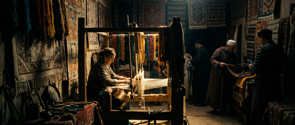
In a sunlit studio in Santa Fe, Ramona Sakiestewa sits before a massive floor loom, her fingers moving in the same rhythm her Hopi grandmother taught her sixty years ago. The warp threads stretch taut, vertical lines that have remained unchanged since ancient Pueblo weavers first pulled cotton from the earth. But the pattern emerging beneath her hands tells a different story entirely. Geometric forms in deep indigo and rust red create a composition that would feel at home in a Mondrian painting, yet every motif carries the weight of centuries-old symbolism.

Threading Time: How Ancient Textile Traditions Weave Through Contemporary Art

This is where textile arts live today. Not in museums under glass, but in the active spaces where contemporary artists engage with cultural traditions that stretch back millennia. These artists understand something that many contemporary art movements miss: innovation doesn’t require abandoning the past. You can find new ways to speak through tradition instead.

Sakiestewa pauses to adjust a thread that has gone slack. “People think tradition means doing exactly what your ancestors did,” she says, her voice carrying the same measured cadence as her weaving. “But tradition is a conversation across time. My grandmother wove to clothe her family. I weave to clothe ideas.”

Illustration for Threading Time: How Ancient Textile Traditions Weave Through Contemporary Art

The Global Thread

Walk into any major contemporary art fair today and you’ll find textile work that defies easy categorization. In New York galleries, Ghanaian artist El Anatsui’s massive metal cloth sculptures cascade from walls like liquid gold, each piece constructed from thousands of discarded bottle caps and aluminum strips. The technique echoes traditional kente weaving patterns, but the materials speak to contemporary concerns about consumption and waste. It’s beautiful and unsettling at once.

Meanwhile, in Mexico City, artist Tanya Aguiñiga creates large-scale installations using traditional Oaxacan weaving techniques combined with industrial materials. Her recent piece at the Museum of Contemporary Art has hand-woven sections made from plastic bags collected from the US-Mexico border, each strand carefully cleaned and processed using methods passed down through generations of indigenous weavers. The result forces viewers to reconsider both the value of traditional craft knowledge and the reality of contemporary migration.

These artists represent a larger movement that’s reshaping how we think about cultural heritage in art. They’re not appropriating traditions from other cultures, but rather mining their own ancestral knowledge for contemporary relevance. The distinction matters enormously. It creates space for authentic voices while avoiding the pitfalls of cultural tourism that have plagued textile arts in commercial contexts.

Threads of Resistance

The political power of textile work becomes most apparent when you understand its historical context. In many cultures, weaving was women’s work, which meant it was both essential and undervalued. Colonial powers often targeted textile traditions as a way of disrupting cultural identity. The British systematically destroyed India’s cotton industry to protect their own markets. Spanish colonizers banned indigenous weaving patterns in the Americas, recognizing their role in maintaining cultural memory.

Today’s textile artists understand this history in their bones. When Pakistani-American artist Anila Quayyum Agha creates delicate paper installations that cast geometric shadows reminiscent of Islamic patterns, she’s not just making beautiful objects. She’s reclaiming visual languages that have been marginalized or misunderstood in Western contexts. Her piece “Intersections” fills entire gallery spaces with shifting patterns of light and shadow, inviting viewers to move through spaces that feel both ancient and futuristic.

When Hmong-American artist Koua Her incorporates traditional paj ntaub needlework into large-scale contemporary pieces, she’s addressing the messy realities of displacement and cultural preservation. Her work appears in major museums now, but it emerges from techniques her mother used to create story cloths documenting their family’s journey from Laos to American refugee camps. Each stitch carries both aesthetic and historical weight.

The Contemporary Renaissance

What strikes me about this current moment in textile arts is how it’s pulling in artists who might have previously worked in more traditionally “fine art” media. Painter Kerry James Marshall has begun incorporating fabric and thread into his work, drawing on the quilting traditions of his grandmother while maintaining his distinctive visual style. The combination creates layers of meaning that neither medium could achieve alone.

The rise of social media has also changed access to traditional techniques in ways we’ve never seen before. Young artists in urban centers can now learn traditional weaving methods through online communities that connect them directly with master practitioners from around the world. This direct transmission bypasses the academic institutions that historically controlled access to art education, creating space for more diverse voices and approaches.

Museums are paying attention. The Whitney Museum’s recent exhibition “Pacha, Llaqta, Wasichay: Indigenous Space, Modern Architecture, and Art” put contemporary Andean textile work alongside architectural installations, acknowledging the sophisticated spatial and mathematical concepts embedded in traditional weaving practices. The Metropolitan Museum of Art has expanded its textile galleries to include more contemporary work, recognizing that the line between historical artifact and living tradition is more blurred than previous curatorial approaches suggested.

Weaving Forward

The artists working at the intersection of traditional textile practices and contemporary art are doing more than creating beautiful objects. They’re proving that cultural preservation and innovation can coexist, that ancient techniques can speak to urgent contemporary concerns, and that the hands that have always made the cloth can also reshape the art world’s understanding of what counts as serious artistic practice.

As Sakiestewa works in her Santa Fe studio, creating pieces that will hang in major museums, she’s part of something larger than her individual artistic practice. She’s connected to a global community of makers who understand that the future of art doesn’t mean abandoning the past, but finding new ways to honor and extend it. The threads they weave today will become the traditions that future artists inherit, adapt, and transform in their own time.

Next time you encounter textile work in a gallery or museum, take a moment to consider the conversations happening across time through those threads. Look closely at how traditional techniques create space for contemporary ideas, how ancient patterns speak to current concerns, how the act of making connects us to both past and future in ways that pure conceptual art rarely achieves.

Categories
Main

When Kandinsky’s Circles Started Dancing: How Musical Rhythms Reshape What We See

When Kandinsky's Circles Started Dancing: How Musical Rhythms Reshape What We See

The Moment Sound Becomes Color

I was standing in front of Kandinsky’s “Composition VII” at the Tretyakov Gallery when the security guard hummed a few bars of Bach under his breath. Suddenly, those swirling forms and explosive color patches weren’t just paint anymore. They were following the same mathematical progressions, the same push and pull of tension and release that made the guard’s melody so satisfying. The painting had rhythm. Once I heard it, I couldn’t unsee the music in every brushstroke.

This wasn’t coincidence. Kandinsky, like many artists working in the early 1900s, believed that color had sound and that visual art could achieve the same emotional directness as music. He called it “spiritual resonance,” but what he was really describing was synesthesia. You know, that weird neurological thing where hearing a sound automatically triggers colors, or seeing certain shapes makes you taste metal. When Kandinsky painted those famous circles in bright yellows and deep blues, he was translating what it felt like to hear music into something the rest of us could see.

Jazz Rhythms in Mondrian’s Grid

Piet Mondrian’s geometric abstractions might seem worlds away from the smoky jazz clubs of 1920s New York, but look closer at his “Broadway Boogie Woogie” and you’ll hear those syncopated rhythms that turned American music upside down. Those small squares of red, yellow, and blue aren’t randomly placed. They follow the same off-beat patterns that made boogie-woogie piano so addictive.

Mondrian spent his final years in Manhattan, and the city’s energy seeped into his work in ways nobody expected. He stopped using black lines entirely. Instead, he used colored rectangles that seem to flicker and dance across the canvas. The painting captures the stop-and-start rhythm of city traffic, the irregular pulse of neon signs, and yes, the musical innovations happening in Harlem nightclubs. Each color square is a beat, a note, a moment where what you see and what you hear merge into something completely new.

This connection between jazz and abstract art wasn’t just Mondrian’s thing. Stuart Davis, working in America around the same time, created paintings that looked exactly like jazz sounded. Angular, improvisational, full of unexpected color combinations that somehow worked perfectly together. His “Swing Landscape” from 1938 translates the experience of listening to Count Basie into bold geometric shapes that seem to move right off the wall.

The Color Theory Revolution

The relationship between music and visual art runs deeper than individual artists getting inspired by whatever was playing on the radio. Both art forms experienced parallel revolutions in how they understood their basic building blocks. Just as composers in the early 20th century began experimenting with atonal music and completely new harmonic structures, painters were discovering that color could function independently of representation.

Josef Albers, working at the Bauhaus school in Germany, developed color studies that operated like musical scales. His famous “Homage to the Square” series explores how colors influence each other when placed side by side. It’s the visual equivalent of harmonic intervals in music. A yellow square nested inside an orange one creates a different “chord” than the same yellow surrounded by blue. Albers taught students to see color relationships the way musicians hear chord progressions, as systems of tension and resolution that either work or they don’t.

This wasn’t just theoretical classroom stuff. Albers collaborated directly with composers, including his colleague John Cage, to create performances where color changes accompanied musical phrases. Their work at Black Mountain College in the 1950s established the foundation for all the multimedia art we take for granted today. When you watch a concert where lighting design responds to the music, you’re experiencing the legacy of these early experiments.

Street Art Finds Its Beat

Walk through any major city today and you’ll see this music-visual art connection playing out on walls, underpasses, and subway platforms. Hip-hop culture emerged in the 1970s with four distinct elements: DJing, MCing, breaking, and graffiti. They’ve remained connected ever since. The visual rhythms of a well-executed piece mirror the layered samples and beats that define hip-hop production.

Graffiti artists like FUTURA 2000 and Rammellzee understood this instinctively. Their letter-based abstractions don’t just spell words. They create visual music, with each letter functioning like an instrument in an ensemble. The way colors flow into each other, the repetition of certain shapes, the careful balance of thick and thin lines—it all follows principles that any DJ would recognize from mixing tracks.

Contemporary street artists continue this tradition, but with expanded tools and techniques. Take the work of Os Gemeos, twin brothers from São Paulo whose large-scale murals incorporate the rhythmic complexity of Brazilian music into their visual compositions. Their figures seem to dance across building walls, frozen mid-movement in poses that capture the syncopated energy of samba and bossa nova.

Finding the Beat in Your Local Gallery

The next time you visit a museum or gallery, try listening to the art instead of just looking at it. Pay attention to repetition—the way brushstrokes create visual rhythms, how color patterns establish and then break expectations. Notice which artworks feel fast or slow, which ones seem to have complex polyrhythms and which ones follow simpler, more predictable beats.

This isn’t about finding hidden meanings or proving that artists secretly embedded musical codes in their work. It’s about recognizing that human perception operates across multiple channels simultaneously. Great art often succeeds because it engages more than one sense at a time. When you start to hear the music in visual art, you’re not just being creative. You’re tapping into the same neurological processes that made Kandinsky’s circles dance and gave Mondrian’s grids their boogie-woogie swing.

Here’s something fun to try: bring headphones to your next gallery visit and experiment with different soundtracks while viewing the same pieces. You’ll be amazed how dramatically the music changes what you see, and how certain combinations reveal visual rhythms you never noticed before. Just don’t blame me when you start seeing Beethoven’s symphonies in every Rothko painting.

Categories
Main

The Watercolor Arsenal: Tools That Transform Pigment Into Poetry

The Sacred Trinity: Paper, Paint, and Brushes

Before we get into the specifics, let’s acknowledge something fascinating about watercolor: it’s the only painting medium where your support actually participates in the creation. Unlike oil or acrylic painting, where canvas is a passive receptor, watercolor paper becomes your collaborator. The tooth of the paper grabs pigment, the sizing controls flow, and the weight determines how much water you can push before buckling occurs. This isn’t just technical information—it’s why Sargent’s loose portrait sketches have such immediacy, or how contemporary artists like Alvaro Castagnet create those luminous architectural studies that seem to breathe light.

The Watercolor Arsenal: Tools That Transform Pigment Into Poetry

Your paper choice sets the stage for every mark you’ll make. Cold-pressed papers, with their subtle texture, offer the perfect balance for beginners. Enough tooth to hold washes but smooth enough for detail work. Think of Winslow Homer’s seascapes: those confident, sweeping passages of color that capture the essence of water and sky rely on paper that can handle both bold washes and precise notation. Hot-pressed papers, silky and smooth, demand more control but reward you with the crisp edges you see in botanical illustrations. Rough papers create that broken, sparkling effect that makes you think of Turner’s late works, where pigment catches only the peaks of the paper’s surface.

When selecting your first papers, invest in quality from the start. Arches, Fabriano, and Saunders Waterford have earned their reputations through centuries of supporting masterworks. Their 100% cotton fiber construction means your paintings won’t yellow or deteriorate, and the consistent sizing gives you predictable paint behavior. Start with 140lb cold-pressed paper. It’s forgiving enough for learning yet sophisticated enough to grow with your skills. The extra cost pays dividends in results and eliminates the frustration of fighting poor materials while learning fundamental techniques.

Illustration for The Watercolor Arsenal: Tools That Transform Pigment Into Poetry

Pigments That Sing: Understanding Your Palette

Professional watercolors contain pigments that have traveled through art history like old friends visiting new studios. The ultramarine blue on your palette shares DNA with the lapis lazuli that illuminated medieval manuscripts. Your cadmium yellows carry the same luminous power that Post-Impressionists used to capture Mediterranean sunlight. This continuity matters because understanding pigment properties—transparency, staining power, granulation—connects you to centuries of artistic problem-solving.

Start with a focused palette of professional-grade colors rather than a sprawling student set. Winsor & Newton, Daniel Smith, and Schmincke offer tube colors with the pigment concentration and lightfastness that serious work demands. Your essential palette might include ultramarine blue and cerulean blue for sky and shadow work, cadmium yellow medium and raw sienna for warm earth tones, alizarin crimson and burnt sienna for rich darks and skin tones. This limited palette forces you to understand color mixing. It’s the same discipline that made Andrew Wyeth’s seemingly simple palette yield such complex emotional resonance.

Pay attention to pigment characteristics that student-grade paints mask or eliminate entirely. Genuine ultramarine granulates beautifully, creating those subtle textural effects you see in atmospheric passages. Raw sienna’s transparency makes it perfect for glazing techniques, while cadmium colors offer opacity for confident, assertive marks. These qualities aren’t accidents—they’re tools that masters have exploited for specific expressive purposes. When you understand why Cézanne preferred certain earth tones or how Monet used the staining power of alizarin crimson, you’re not just buying paint. You’re accessing a vocabulary of visual expression.

The Extension of Intent: Brush Selection and Care

A watercolor brush must hold water, release it controllably, and return to a perfect point or edge. These aren’t simply functional requirements. They’re the mechanical prerequisites for translating artistic vision into physical reality. Watch a master painter work, and you’ll notice how brush choice changes with intent: broad flats for architectural elements and sky washes, rounds for organic forms and detail work, riggers for linear elements like ship rigging or bare branches.

Kolinsky sable brushes represent the pinnacle of watercolor tools, but their cost can intimidate beginners. Here’s the secret: you need only a few excellent brushes rather than many mediocre ones. A high-quality round brush in size 14 can handle surprisingly detailed work when used on its tip, while providing enough water capacity for significant washes. Add a smaller round (size 6 or 8) for detail work and a flat brush for geometric shapes and clean edges, and you’ve covered most painting situations. Synthetic brushes have improved dramatically—Princeton and Silver Black Velvet offer excellent water-holding capacity and point retention at accessible prices.

Brush care goes beyond mere maintenance. It’s about preserving tools that become extensions of your artistic intent. Clean brushes immediately after use, reshape them while damp, and store them tip-up or flat. A damaged brush point forces you to fight your tools rather than focus on artistic decisions. Consider how Chinese brush painters have elevated tool care to ritual status: the cleaning and reshaping of brushes becomes a meditative transition between painting sessions, a moment to reflect on what was accomplished and what comes next.

The Supporting Cast: Essential Accessories for Success

The romance of watercolor often focuses on the primary tools, but success depends equally on thoughtful preparation and environmental control. Natural sponges provide texture and lifting capabilities that synthetic alternatives can’t match. Their irregular surfaces create organic patterns that complement watercolor’s fluid nature. Paper towels and cotton rags serve different functions: towels for quick moisture control, soft cloth for gentle blending and soft edges.

Water containers deserve more thought than they typically receive. Two jars prevent muddy colors: one for initial cleaning, one for final rinse. Glass containers let you monitor water clarity, while wide mouths accommodate large brushes without damage. A spray bottle maintains paint moisture during longer painting sessions and can create atmospheric effects when used skillfully. Masking tape, carefully selected for gentle adhesion, protects edges and creates crisp geometric elements.

Your palette choice affects both color mixing and paint economy. Ceramic palettes with deep wells accommodate generous paint quantities and clean easily. Stay-wet palettes extend working time for tube colors. Some painters prefer disposable paper palettes for outdoor work, while others swear by traditional porcelain plates that provide neutral backgrounds for accurate color assessment. The key is consistency—using the same palette type builds muscle memory for paint placement and color relationships.

Building Your Foundation: A Graduated Approach

Beginning watercolor painting isn’t about acquiring every possible tool. It’s about understanding how each element contributes to your expanding artistic vocabulary. Start with quality basics: good paper, professional paints in a limited palette, and a few excellent brushes. Master these tools thoroughly before adding specialty items. This approach mirrors how traditional apprenticeship worked: deep familiarity with fundamental materials before exploring variations and innovations.

Your tool collection should grow organically with your artistic development. As you discover particular interests—perhaps botanical illustration, urban sketching, or abstract color studies—specific tools will suggest themselves. A rigger brush for detailed linear work. Specialty papers with unique textures. Granulating medium for textural effects. This natural progression makes sure each new tool serves a genuine artistic purpose rather than simply expanding your collection.

Remember that tools enable vision but don’t create it. The same brushes and pigments available today produced both masterworks and failures throughout history. Your developing eye, your growing understanding of how water and pigment interact, your emerging personal voice—these matter far more than having the latest supplies. Begin with good tools, treat them with respect, and let your artistic curiosity guide future acquisitions. The conversation between artist and materials develops over time, built on countless small discoveries about how intention becomes reality through the mysterious alchemy of water, pigment, and paper.

Categories
Main

Why Your Local Art Museum Beats the Met (And the Art World Doesn’t Want You to Know It)

The Conspiracy of Cultural Capital

Let me tell you something the art establishment hopes you never figure out: those small town museums tucked away in converted Victorian mansions and repurposed train stations are quietly housing some of the most revelatory art experiences you’ll ever encounter. While everyone flocks to the Met or MoMA, posting obligatory selfies with Starry Night, they’re missing the real revolution happening in places like the Figge Art Museum in Davenport, Iowa, where you can stand inches away from a Grant Wood painting and actually see how he built those rolling hills layer by microscopic layer.

Why Your Local Art Museum Beats the Met (And the Art World Doesn't Want You to Know It)
Why Your Local Art Museum Beats the Met (And the Art World Doesn’t Want You to Know It)

The big institutions became victims of their own success, drowning in crowds and choking on their curatorial orthodoxy. They’re too busy protecting their brand and managing visitor flow to take the kinds of risks that make art dangerous and transformative. Meanwhile, that little museum in your hometown quietly mounts exhibitions that would make Chelsea gallery owners weep with envy, if only they could see past their own metropolitan myopia.

Consider the Brandywine River Museum of Art in Pennsylvania, where you can trace three generations of Wyeth family genius without fighting through tour groups or listening to someone’s loud phone conversation echoing off marble walls. The intimacy changes everything. You start to notice how N.C. Wyeth’s dramatic illustrations influenced his son Andrew’s hyperrealist technique, which then evolved into grandson Jamie’s contemporary abstractions. It’s a masterclass in artistic DNA that no blockbuster exhibition could ever reproduce.

Illustration for Why Your Local Art Museum Beats the Met (And the Art World Doesn't Want You to Know It)
Illustration for Why Your Local Art Museum Beats the Met (And the Art World Doesn’t Want You to Know It)

The Curatorial Freedom That Comes With Obscurity

Small town museums operate under different rules, and thank god for that. They’re not beholden to board members whose primary concern is donor relations or attendance figures that satisfy municipal budgets. This freedom produces some of the most thoughtful, unexpected programming you’ll find anywhere. The Butler Institute of American Art in Youngstown, Ohio, regularly puts 19th-century Hudson River School paintings next to contemporary video installations, creating conversations about landscape and technology that major museums wouldn’t dare attempt without six months of committee meetings.

I’ve watched curators at these smaller institutions take risks that would send Met executives into panic attacks. The Shelburne Museum in Vermont once displayed a Monet water lily painting next to a 1950s carousel horse, both positioned to catch the same northern light streaming through tall windows. The effect was brilliant. Suddenly you could see how both artists understood the relationship between surface and depth, between movement and stillness. Try explaining that concept to a blockbuster exhibition planning committee.

These curators aren’t climbing career ladders or positioning themselves for tenure at prestigious universities. They’re true believers, often scholars who chose passion over prestige. They know their collections inside out because they’ve lived with these works for years, sometimes decades. When the curator at the Rockwell Museum in Corning, New York, describes how Norman Rockwell achieved that particular shade of autumn light in “Freedom from Want,” she’s not reciting catalog copy. She’s sharing discoveries made during countless hours of direct observation.

The Radical Act of Seeing Without Mediation

Here’s what the major museums will never admit: their success became their greatest liability. The endless streams of visitors, the mandatory audio guides, the barrier ropes and security guards, all of it conspires to keep you from actually experiencing art. You’re consuming it instead, checking boxes on a cultural to-do list. But walk into the Munson-Williams-Proctor Arts Institute in Utica, New York, on a Tuesday afternoon, and you might find yourself alone with a room full of Thomas Cole landscapes. Alone. With genius. For as long as you want.

This solitude transforms everything about how art works. Without crowds pressing behind you, you can step back and forth, watching how a painting changes with distance and angle. You can notice how the brushwork in a Winslow Homer seascape becomes more abstract as you move closer, how those churning waves dissolve into pure gesture and color. You start to understand that painting is a physical act, not just a visual one. The artist’s hand becomes visible in ways that reproduction and overcrowding make impossible.

I remember standing in the Hyde Collection in Glens Falls, New York, watching afternoon light move across a Degas pastel. For twenty minutes, the changing light revealed new layers of color, different tensions in the composition. The dancer’s pose shifted subtly as shadows deepened and highlights emerged. It was like watching the artist work, seeing the painting complete itself in real time. No major museum would tolerate a visitor lingering that long, and artificial lighting would have eliminated the natural drama entirely.

Regional Identity as Radical Curation

The most subversive thing about small town art museums isn’t what they collect, it’s how they frame it. These institutions understand that art doesn’t exist in a vacuum, that regional history and local culture aren’t obstacles to overcome but essential parts of interpretation. The Montclair Art Museum in New Jersey doesn’t just display George Inness paintings. It shows you how his romantic landscapes reflected specific philosophical and social movements that shaped 19th-century American culture, particularly in the Northeast.

This approach produces insights that cosmopolitan institutions miss entirely. The Arnot Art Museum in Elmira, New York, has an extraordinary collection that reflects the industrial boom of the late 1800s, when local business magnates competed to acquire European masterworks. But instead of presenting these as decontextualized treasures, the museum explores how American industrialists used art to construct cultural legitimacy. Suddenly, a room full of academic paintings becomes a complex story about class, taste, and national identity.

The regional perspective also allows for unconventional comparisons and unexpected discoveries. The Everson Museum in Syracuse can display a Rothko chapel painting alongside ceramics by Adelaide Robineau, both created within fifty miles of each other but exploring entirely different approaches to spiritual expression through color and form. These local connections create new ways of understanding art that transcend traditional categories and periods.

The Future Belongs to the Margins

As major museums struggle with attendance drops, funding crises, and mounting criticism about accessibility and representation, small town institutions are quietly pointing toward a more sustainable future for arts culture. They’ve always operated with limited resources, forcing innovation and creativity that bigger institutions can learn from. They’ve maintained authentic relationships with their communities instead of treating visitors as consumers to be processed efficiently through predetermined experiences.

The most exciting contemporary art conversations are happening in these overlooked spaces. The Museum of Art and History in Lancaster, California, recently mounted an exhibition exploring how aerospace industry workers in the Antelope Valley created art during their off hours, revealing a hidden creative community that challenges every assumption about who makes art and where it matters. No major museum would have the local knowledge or institutional flexibility to pursue such a project.

What excites me most is how these museums are redefining what cultural authority looks like. Instead of dictating taste from above, they’re showing how deep engagement with specific places and communities can produce universal insights. They’re proving that the future of art appreciation isn’t about bigger crowds or more famous names. It’s about creating conditions for genuine encounter and discovery.

So next time you plan a cultural pilgrimage, skip the tourist traps and seek out the converted mansion or former bank building that houses your region’s hidden collection. Spend an afternoon discovering what your local curators have been quietly protecting and celebrating. You might find that the most profound art experiences have been waiting in your own backyard, ready to challenge everything you thought you knew about seeing and understanding art.

Categories
Main

The Watercolor Supply Industry Is Lying to You: What Beginning Painters Actually Need

The Myth of the Perfect Starter Set

Walk into any art supply store and you’ll be confronted with glossy watercolor “starter sets” promising everything a beginner needs in one convenient package. These sets are masterpieces of marketing psychology, not artistic necessity. They typically contain dozens of tiny paint tubes in garish colors like “brilliant orange” and “magenta” that most painters will never touch, paired with brushes so poorly made they shed like a Persian cat in summer.

The Watercolor Supply Industry Is Lying to You: What Beginning Painters Actually Need

The real tragedy isn’t the money wasted on unnecessary supplies. It’s that these sets actively sabotage learning by overwhelming beginners with choices while providing subpar tools that make good technique nearly impossible. When your brush can’t hold water properly or your paint refuses to flow smoothly, you’ll blame your inexperience rather than your equipment. This creates a cycle where struggling artists buy more supplies hoping to solve problems that better initial choices would have prevented.

The industry profits from this confusion, but history tells a different story. When Turner was revolutionizing landscape painting, he worked primarily with earth pigments and a handful of reliable brushes. Winslow Homer’s glowing watercolors emerged from disciplined restraint, not an arsenal of synthetic colors. The lesson isn’t to reject modern innovations, but to understand that mastery grows from deep exploration, not buying more options.

Illustration for The Watercolor Supply Industry Is Lying to You: What Beginning Painters Actually Need

The Three-Color Revolution You’ve Never Heard About

Here’s where I’ll lose half my readers: you need exactly three colors to begin watercolor painting seriously. Not twelve, not twenty-four, certainly not the forty-eight tube sets marketed to eager beginners. Ultramarine blue, burnt sienna, and cadmium yellow form what colorists call a “perfect triad.” These three pigments can mix virtually any color you’ll encounter in nature. Learning to combine them teaches color theory in ways that pre-mixed convenience colors never will.

This isn’t artistic snobbery talking. It’s practical wisdom gained from watching countless students struggle with mud-colored disasters because they grabbed the first green or purple from their palette instead of learning to mix it fresh. When you mix your own secondary colors, you understand their temperature, their opacity, their personality. You learn that the green mixed from ultramarine and cadmium yellow sings differently than one mixed from the same yellow and Prussian blue.

Professional colorists know this secret. Film production designers work from limited palettes to ensure visual coherence. Interior designers build entire room schemes around three foundational colors. The Impressionists revolutionized painting not by using more colors, but by understanding how a few colors could interact with light and shadow to create the illusion of infinite variety. Your grandmother’s quilt patterns, those geometric compositions that catch your eye across a crowded antique shop, work precisely because they explore endless variations within strict chromatic boundaries.

The Brush Heresy: Why Expensive Doesn’t Mean Better

The art supply industry wants you to believe that good watercolor brushes require animal hair harvested under specific lunar conditions from pampered Siberian sables. This is romantic nonsense that separates beginners from their money while making them feel inadequate when they can’t justify spending $200 on a single brush. The dirty secret? Some of the most expressive watercolor work in contemporary galleries comes from artists using synthetic brushes that cost less than a fancy coffee.

Modern synthetic brush technology has reached remarkable sophistication. High-quality synthetic filaments can hold water as effectively as natural hair while maintaining their point through hundreds of painting sessions. They’re also more forgiving of the inevitable abuse that beginning painters inflict through improper cleaning and storage. When Georgia O’Keeffe was developing her distinctive style in the 1920s, synthetic brushes didn’t exist. Yet she often worked with inexpensive bristle brushes that horrified her more traditional colleagues.

The real consideration isn’t the hair source but the brush architecture. You need one round brush capable of both fine detail and broad washes. Size 10 or 12 provides versatility that smaller brushes can’t match. A well-made synthetic in this size will teach you more about watercolor handling than a collection of expensive specialty brushes that encourage technique-hopping instead of skill development. Master painters throughout history succeeded because they knew their tools intimately, not because they owned the most tools.

Paper Politics: The Support That Actually Supports

Paper discussions in watercolor circles often devolve into brand loyalty that resembles wine snobbery more than practical advice. Artists develop passionate allegiances to specific manufacturers and paper weights, defending their choices with the fervor of sports fans. This misses the fundamental point: paper is your painting’s foundation, and like any foundation, its job is to support the structure you’re building, not to announce its own presence.

The essential requirement is weight, specifically 140lb (300gsm) minimum. Lighter papers buckle and warp when wet, creating pooling problems that destroy smooth washes and frustrate beginners who assume they’re doing something wrong. The surface texture matters less than you’ve been told. Hot-pressed, cold-pressed, rough. These variations affect the final appearance, but they don’t determine success or failure. Van Gogh painted some of his most celebrated watercolors on whatever paper he could afford, including cheap writing paper that would make contemporary artists shudder.

The real controversy should center on size. Art schools and instructional books typically recommend small formats for beginners, supposedly to reduce intimidation and material waste. This is backwards thinking. Small formats encourage tight, fussy painting that fights against watercolor’s natural fluidity. Working larger, 11×14 inches minimum, forces you to use broader gestures, embrace happy accidents, and develop the confident approach that makes watercolor sing. When you’re cramped into a 6×8 inch format, you’re essentially learning to paint miniatures, not watercolors.

The Palette Conspiracy: Why Your Mixing Surface Matters More Than Your Paint

Most watercolor advice focuses on pigments while completely ignoring the palette, treating it as a mere container rather than an active participant in the painting process. This oversight reveals a fundamental misunderstanding of how watercolor actually works. Your palette isn’t just storage. It’s your mixing laboratory, your color memory, and often your best teacher about how pigments behave in different combinations and concentrations.

Disposable paper palettes, those tear-off sheets beloved by manufacturers, work against watercolor’s essential nature. Watercolor pigments perform best when they’re given time to dissolve properly, when you can return to partially dried mixtures and reactivate them with fresh water. Paper palettes absorb moisture, change the color temperature of your mixes, and encourage wasteful painting habits because they make cleanup too easy. You’ll learn more about color mixing in one week with a proper palette than in months of fighting absorbent paper surfaces.

A simple ceramic dinner plate works better than most commercial palettes. The white surface shows true color relationships without the subtle color shifts that plastic palettes introduce. The non-absorbent surface keeps your paints workable longer and allows for the kind of spontaneous mixing that creates those magical color transitions that make watercolor painting addictive. Picasso reportedly did some of his blue period work using dinner plates as palettes, not from poverty, but because he understood that the right working surface supports creative flow rather than hindering it.

These tool choices aren’t just practical decisions. They’re creative philosophy made manifest. Every brush you choose, every color you squeeze onto your palette, reflects assumptions about how art happens and what kind of painter you want to become. What other essential tools have you discovered that contradict conventional wisdom? What supplies have you abandoned that everyone else swears by?

Categories
Main

Why Your Local Potter Throws Better Pots Than Most Museum Pieces

Last week I watched a potter at the downtown farmers market throw a bowl that would make any Ming Dynasty craftsman weep with envy. Her hands moved with the same fluid precision I’ve seen in 2,000-year-old Japanese tea bowls, yet she was using techniques that most ceramic curators would dismiss as “too accessible” or “commercially driven.” This disconnect between what we celebrate in museums and what we overlook in contemporary practice reveals something troubling about how we value ceramic art.

The reality is that many of today’s working potters have mastered ancient techniques with an intimacy and daily practice that surpasses the occasional masterpiece we’ve elevated to museum status. While we venerate the rarity of surviving historical ceramics, we’re missing the revolution happening in studios across the world where traditional methods are being refined, adapted, and frankly, perfected.

Why Your Local Potter Throws Better Pots Than Most Museum Pieces

The Raku Revival That Museums Missed

Walk into any contemporary ceramics studio and you’ll likely find someone experimenting with raku firing, the 16th-century Japanese technique that involves pulling red-hot pottery from kilns and plunging it into combustible materials. What’s fascinating isn’t just that this ancient method survived, it’s how modern practitioners have pushed it beyond its original ceremonial tea bowl origins into sculptural territory that would have been unimaginable to its creators.

Paul Soldner revolutionized raku in the 1960s by introducing Western glazes and larger forms, but today’s potters are taking even bolder leaps. They’re using recycled materials for reduction chambers. They’re experimenting with digital temperature monitoring for more precise control. Some are creating installation pieces that sprawl across gallery walls. The technique remains fundamentally unchanged, rapid cooling, dramatic reduction, unpredictable results, but its applications have exploded into contemporary art practices that museums are only now beginning to recognize.

The irony is that while we treasure the handful of historical raku pieces that survived centuries of fragility, we often overlook the thousands of contemporary works that demonstrate a deeper understanding of the medium. Modern raku artists aren’t just recreating ancient methods. They’re pushing the chemical and physical boundaries of what clay bodies and glazes can withstand, creating work that’s technically superior to many historical precedents.

Pit Firing’s Unexpected Contemporary Renaissance

Even more dramatic is the resurgence of pit firing, humanity’s oldest ceramic technique. For thousands of years, potters buried their work in earth kilns, using organic materials like seaweed, banana leaves, and cow dung to create the smoky, earth-toned surfaces that we now associate with “primitive” pottery. Contemporary ceramicists have reclaimed this method not as historical reenactment, but as sophisticated surface treatment that achieves effects impossible with modern kilns.

Maria Martinez’s famous black-on-black pottery from San Ildefonso Pueblo demonstrates how traditional pit firing techniques can produce work that transcends any simple historical categorization. Her mastery of reduction firing in outdoor kilns created surfaces with such subtle variation and depth that they rival any contemporary gallery piece. Yet because her work emerged from continuous cultural practice rather than fine art training, it took decades for museums to recognize its worth.

Today’s pit firing practitioners are building on this foundation with scientific precision that ancient potters couldn’t have imagined. They’re documenting temperature curves. They’re experimenting with specific organic materials for predictable color results. They’re combining traditional reduction methods with contemporary forming techniques. The results are pieces that honor ancient wisdom while pushing ceramic art into entirely new aesthetic territory.

Why Ancient Coiling Techniques Outperform Modern Throwing

Here’s where I’m going to make ceramics purists uncomfortable: hand-building techniques like coiling often produce structurally superior and more expressive work than wheel throwing, despite our cultural bias toward the “mastery” implied by centering clay on a spinning wheel. The coiling methods perfected by Ancestral Puebloan potters over centuries allow for wall thickness variation, asymmetrical forms, and organic shapes that wheel throwing simply cannot achieve.

Contemporary artists like Betty Woodman understood this intimately. Her large-scale ceramic sculptures combined ancient coiling and slab-building techniques with bold contemporary glazing and painting. She could create forms that swelled and contracted, twisted and curved in ways that challenged everything we think we know about ceramic possibilities. Her work proved that “primitive” hand-building techniques could produce complexity and sophistication that mechanical throwing methods constrain.

The speed argument for wheel throwing falls apart when you consider durability and expressiveness. A coiled pot by Lucy Lewis takes longer to construct but can last centuries without cracking, while many wheel-thrown pieces fail within decades due to stress points created by the throwing process. Contemporary hand-builders are rediscovering these structural advantages while developing hybrid techniques that combine ancient wisdom with modern materials science.

Where Traditional Glazing Chemistry Beats Modern Formulation

Perhaps nowhere is the superiority of ancient techniques more evident than in glazing, where traditional methods often achieve effects that modern chemistry struggles to replicate. Chinese celadon glazes developed during the Song Dynasty created depths of color and surface quality that contemporary potters spend lifetimes trying to match. The key difference isn’t just the specific mineral content, it’s the understanding of fire, atmosphere, and timing that can only come from generational knowledge transfer.

Shoji Hamada’s approach to glazing exemplified this traditional mastery applied to contemporary forms. Rather than relying on precise chemical formulations, he developed an intuitive understanding of how local clays, wood ash, and firing conditions interacted to create his signature warm, earthy surfaces. His glazes achieved complexity through imprecision, variations that computer-controlled kilns actively try to eliminate.

Modern ceramicists who embrace this uncertainty often produce the most compelling work. They’re learning that ancient potters understood something we’ve forgotten: the beauty lies not in controlling every variable but in creating conditions where serendipity can flourish within skillful constraints.

The False Hierarchy We’ve Created

The real issue isn’t that ancient techniques are superior to modern methods, it’s that we’ve created an artificial hierarchy that privileges innovation over mastery and individual expression over cultural continuity. We celebrate ceramic artists who “break boundaries” while dismissing traditional practitioners who’ve achieved levels of skill that take generations to develop. This bias blinds us to the reality that the most interesting contemporary ceramic work often emerges from deep engagement with historical methods.

The next time you encounter a potter working with traditional techniques, resist the impulse to categorize their work as nostalgic or conservative. Instead, look for the ways they’re pushing ancient methods into new territory. You might discover that the future of ceramics isn’t about abandoning the past but about understanding it deeply enough to transform it. What traditional ceramic techniques have you encountered that challenged your assumptions about old versus new?

Categories
Main

Why We’re Reading Religious Art All Wrong: The Symbols Everyone Misses

The Icon Police Have Been Lying to Us

Walk into any major art museum and you’ll inevitably encounter that well-meaning docent explaining how the lily in Botticelli’s “Annunciation” represents Mary’s purity, or how the skull in Holbein’s “The Ambassadors” reminds us of mortality. These interpretations aren’t wrong, exactly, but they’re maddeningly incomplete. We’ve turned religious art into a simple game of symbolic matching, reducing centuries of complex theological debate and artistic innovation into flashcard Christianity.

The problem with our current approach to religious symbolism is that it treats artists like they were working from some universal handbook of Christian imagery. In reality, these painters, sculptors, and illuminators were often the most sophisticated theologians of their time, embedding layers of meaning that our sanitized museum explanations completely miss. Take Giovanni Bellini’s “Sacred Allegory” in the Frick Collection. Every art history textbook will tell you about the child representing Christ and the water symbolizing baptism. But nobody talks about how Bellini is actually staging a visual argument about the nature of divine presence that would have scandalized half the Venetian clergy.

We’ve created a kind of symbolic orthodoxy that flattens the radical innovation these artists brought to religious imagery. When Fra Angelico painted his cell frescoes at San Marco, he wasn’t just illustrating Bible stories. He was developing a revolutionary visual theology that treated painting itself as a form of prayer, where the act of looking became a spiritual practice. Yet we reduce his innovations to simple explanations about halos meaning holiness.

The Heretical Subtext Hidden in Plain Sight

Here’s where things get interesting: many of the most celebrated religious artworks contain theological positions that were, at best, controversial and, at worst, borderline heretical. Caravaggio’s “Death of the Virgin” was rejected by the church that commissioned it, not just because he used a prostitute as a model for Mary, but because his interpretation of Mary’s death challenged official doctrine about her assumption into heaven. The painting shows a very human, very mortal woman, swollen with decay, surrounded by grieving apostles. This wasn’t just artistic realism, it was a theological statement about the incarnation that made church officials deeply uncomfortable.

Even more subversive is how artists used traditional symbolic language to smuggle in unorthodox ideas. Look at Hieronymus Bosch’s “Garden of Earthly Delights.” Yes, everyone focuses on the bizarre creatures and sexual imagery, but the real transgression is in how Bosch presents prelapsarian sexuality as natural and joyful rather than shameful. The central panel isn’t depicting sin. It’s imagining what human sexuality might have looked like before the Fall. This was revolutionary thinking disguised as religious allegory.

The most sophisticated artists understood that religious symbolism could be a Trojan horse for ideas that couldn’t be expressed directly. Piero della Francesca’s mathematical precision in works like “The Flagellation of Christ” wasn’t just showing off his knowledge of perspective. He was arguing for a rational, ordered universe that operated according to divine mathematical principles, a position that put him uncomfortably close to the natural philosophers who would later clash with the church over questions of astronomy and physics.

When Context Changes Everything

The biggest mistake we make in reading religious art is assuming that symbols had fixed meanings across different periods and places. The way a Flemish painter in 1450 understood the symbolism of light is fundamentally different from how a Venetian painter understood it fifty years later. Jan van Eyck’s obsession with minute detail and brilliant illumination reflects a Northern European theology that saw God’s presence in the material world itself. Every fold in fabric, every reflection in a mirror, was proof of divine craftsmanship.

Contrast this with Venetian colorito, where artists like Giorgione and Titian used atmospheric effects and loose brushwork to suggest the ineffable nature of divine mystery. When Titian paints the Virgin’s robes in his “Pesaro Madonna,” that rich ultramarine isn’t just expensive pigment showing off the patron’s wealth. It’s a theological statement about how divine truth can only be approached through sensual beauty, not rational analysis.

Even more dramatic are the shifts in symbolic meaning within single artistic traditions. The way Byzantine artists used gold backgrounds to suggest the eternal realm becomes something entirely different when Renaissance artists start experimenting with naturalistic landscapes. When Giovanni Bellini places his Madonnas in detailed Italian countryside settings, he’s not just updating the visual language. He’s arguing that the sacred can be encountered in the natural world, not just in transcendent golden realms.

The Politics Hidden in Holy Images

Religious art was never politically neutral, though we often pretend it was. Every commission came with implicit messages about power, authority, and social order that are invisible if you’re only looking for lily-equals-purity symbolism. Masaccio’s “Trinity” in Santa Maria Novella isn’t just a masterpiece of linear perspective. It’s a careful negotiation of Florentine banking wealth, Dominican theology, and humanist philosophy that would have been immediately legible to contemporary viewers.

The most telling example might be how different patrons used Marian imagery to advance competing political agendas. The Medici family’s patronage of Annunciation scenes wasn’t just pious devotion. It was a way of associating their regime with divine favor and legitimate authority. Meanwhile, republican opponents commissioned images of Mary as Queen of Heaven to suggest that true sovereignty belonged to God alone, not earthly princes.

These political dimensions become even more complex when you consider how religious art functioned in spaces of conflict. The way Protestant reformers selectively destroyed certain types of religious imagery while preserving others reveals sophisticated theological arguments about the proper role of images in worship. They weren’t just smashing “graven images.” They were making careful distinctions between different modes of representation and their spiritual effects.

Reclaiming the Radical Vision

What we’ve lost in our approach to religious art is any sense of its experimental, even revolutionary character. These artists weren’t just illustrating received wisdom. They were pushing the boundaries of how spiritual experience could be visualized and shared. When we reduce their innovations to simple symbolic equations, we miss the genuine intellectual courage it took to reimagine sacred subjects for new contexts and audiences.

The most exciting religious art emerges from moments of theological uncertainty, when artists had to invent new visual languages to express evolving spiritual insights. El Greco’s elongated figures and otherworldly colors weren’t just stylistic choices. They were attempts to visualize mystical experience in ways that went far beyond traditional iconography. His paintings don’t just contain symbols, they are symbols, operating on levels of meaning that resist easy translation into words.

Maybe it’s time to approach religious art with the same spirit of inquiry that originally drove its creation. Instead of looking for predetermined meanings, we might ask what questions these artists were trying to answer, what problems they were attempting to solve through paint and stone. The next time you encounter a religious artwork, don’t just identify the symbols. Ask yourself what the artist might have been arguing, what conventional wisdom they might have been challenging, and how their visual innovations might have changed the way people understood the divine. The conversation that emerges might surprise you.

Categories
Main

Stop Buying What Everyone Tells You: The Watercolor Supply Industry Is Selling You a Fantasy

The Great Watercolor Con: Why Your First Purchases Should Break All the Rules

Walk into any art supply store and you’ll be bombarded with beginner watercolor sets promising everything from “professional quality” to “artist-grade pigments.” Here’s what they won’t tell you: most of these kits are designed to make money, not artists. The industry has convinced us that we need dozens of tubes, specialty papers, and brushes that cost more than a decent meal. But some of the most beautiful watercolor work I’ve seen came from artists who started with supplies that would make purists weep.

The dirty secret is that watercolor marketing preys on our fear of failure. They’ve created a mythology where expensive equals better, where having the “right” tools somehow guarantees success. When I look at the luminous washes in John Singer Sargent’s portraits or the way contemporary artist Alvaro Castagnet captures light with what appears to be effortless spontaneity, I’m not seeing expensive pigments. I’m seeing understanding of how water moves, how color behaves, and how to work with accidents rather than against them.

The truth is more liberating and more challenging: watercolor mastery comes from understanding your medium so intimately that you could create magic with children’s paint sets. The tools matter far less than your relationship with them. This doesn’t mean quality is irrelevant, but it does mean we need to completely rethink what “essential” actually means for someone just beginning this journey.

The Pigment Rebellion: Why Three Colors Beat Thirty

Every watercolor guide will tell you to buy a basic palette of twelve to fifteen colors. This is fundamentally wrong, and here’s why: it’s teaching you to be a consumer of color rather than a creator of it. When you have cadmium yellow, yellow ochre, Naples yellow, and lemon yellow sitting in your palette, you’re not learning to see color relationships. You’re learning to match what’s already there.

Start with three colors: a warm blue like ultramarine, a cool red like alizarin crimson, and a warm yellow like cadmium yellow medium. Add burnt umber if you’re feeling generous. That’s it. This limitation isn’t a handicap, it’s a superpower. Every great colorist in history understood that color harmony comes from relationships, not from having every possible hue at your fingertips. Look at how Andrew Wyeth could suggest an entire autumn landscape with seemingly impossible restraint, or how contemporary artist Joseph Zbukvic creates atmospheric depth with what appears to be the most minimal color choices.

When you’re forced to mix everything, you develop color intuition. You learn that the purple shadow under that yellow flower isn’t something you can squeeze from a tube labeled “shadow purple.” It’s a relationship between your blue and red that changes depending on the temperature of your yellow, the time of day you’re painting, and the emotion you’re trying to capture. This is where real artistry begins.

Paper Wisdom: The Surface That Actually Matters

The paper conversation is where most beginners get completely derailed. Sales associates will steer you toward expensive handmade papers with romantic names and premium price tags. But here’s what they’re missing: the wrong paper won’t just frustrate you, it will actively teach you bad habits. Cheap paper that pills and bleeds unpredictably forces you to work tentatively, never learning how confident brushstrokes actually feel.

Invest in good paper, but be smart about it. Arches cold-pressed watercolor paper in 140lb weight is the gold standard for a reason. It handles water beautifully, forgives mistakes, and responds predictably to both wet and dry techniques. Yes, it’s more expensive than sketch pad paper, but it’s the one supply where quality genuinely transforms your learning experience. Buy it in larger sheets and cut it down rather than purchasing expensive blocks or pads.

The texture matters more than most people realize. Cold-pressed paper has just enough tooth to catch pigment interestingly without being so rough that you can’t achieve smooth washes. Hot-pressed paper is too slick for beginners, despite what you might read about it being good for detailed work. Rough paper has too much texture for someone still learning to control their brushstrokes. You want a surface that works with you as you learn, not one that requires you to already be an expert to handle it properly.

Brush Truth: One Great Tool Beats Ten Mediocre Ones

The brush section is where supply stores make their real money, convincing artists they need different brushes for different techniques, different sizes for different applications, different shapes for different effects. This is where I see beginners spend hundreds of dollars on brushes they’ll never learn to use properly because they’re too busy switching between them to develop real skill with any single tool.

Buy one excellent round brush in size 12 or 14. Make it a kolinsky sable if your budget allows, or a high-quality synthetic if it doesn’t. This single brush can lay down large washes, paint fine details, and everything in between. The secret is learning to use different parts of the brush and varying your pressure and water load. Watch how master watercolorists work: they’re not constantly switching tools. They’re having an intimate conversation with one brush, understanding exactly how it responds to every gesture.

A quality brush holds water properly, maintains its point, and bounces back to shape after each stroke. These aren’t luxury features, they’re essential characteristics that allow you to focus on painting rather than fighting your tools. Add a flat brush later if you find yourself wanting crisp edges regularly, but resist the urge to collect brushes like trophies. Each new brush is a new relationship to learn, and beginners need to go deep with their tools, not wide.

The Minimalist’s Advantage: Why Less Creates More

The most radical thing you can do as a beginning watercolor painter is embrace radical simplicity. Not because you can’t afford better supplies, but because limitation breeds creativity in ways that abundance never can. When you’re working with three colors, one brush, and good paper, every mark matters. Every color mixture is intentional. Every brushstroke carries weight.

This approach flies in the face of everything the art supply industry wants you to believe, but it aligns perfectly with how great artists actually develop. They don’t start by collecting tools, they start by developing vision. They don’t begin with complex techniques, they begin by understanding how their medium behaves under different conditions. The fancy supplies come later, after you’ve developed the judgment to know what you actually need versus what marketing tells you to want.

The goal isn’t to stay minimal forever, but to build a foundation so solid that when you do add new colors, new brushes, or new techniques, you’re adding them strategically rather than desperately. You’re expanding from strength rather than trying to buy your way to competence.

What has your experience been with watercolor supplies? Have you found that expensive tools made you a better artist, or did they just make you more afraid to make mistakes? I’d love to hear about your own discoveries in learning to see beyond the marketing to what actually supports the art.

Categories
Main

The Ancient Hand in Modern Clay: How Millennia-Old Techniques Shape Contemporary Ceramics

When Past Meets Present in the Potter’s Studio

Walk into any contemporary ceramics studio today, and you’ll see something pretty amazing: artists reaching across thousands of years to use techniques that predate written language itself. The wheel spinning under their hands connects them directly to potters in ancient Mesopotamia, while the glazes they mix echo formulas first developed in Tang Dynasty China. This isn’t just nostalgia or romantic attachment to the past. Modern ceramicists get what art historians have long recognized—that the most interesting innovations often come from a deep conversation with tradition.

The Ancient Hand in Modern Clay: How Millennia-Old Techniques Shape Contemporary Ceramics

Take Ai Weiwei, who creates massive installations of deliberately broken Han Dynasty-style vases that say everything about cultural continuity and destruction. His technique draws directly from methods perfected over two millennia ago, yet his conceptual framework is completely contemporary. This combination shows how ancient ceramic techniques provide not just technical knowledge, but a rich vocabulary of cultural meaning that modern artists can manipulate, subvert, and celebrate.

The relationship between ancient and modern ceramics really shows itself in the workshop, where contemporary potters find themselves rediscovering principles that have remained unchanged since humans first shaped clay around fire. The basic physics of clay bodies, the chemistry of glazes, the behavior of kilns—these constants create an unbroken chain of knowledge that makes ceramics unique among the arts in maintaining direct technical continuity with its deepest historical roots.

Illustration for The Ancient Hand in Modern Clay: How Millennia-Old Techniques Shape Contemporary Ceramics

The Resurrection of Raku and the Philosophy of Imperfection

No ancient technique has grabbed modern attention quite like raku, the 16th-century Japanese firing method that turns clay into something resembling controlled chaos. Originally developed for tea ceremony bowls, raku embraces the Japanese aesthetic principle of wabi-sabi—finding beauty in imperfection and impermanence. When contemporary ceramicist Paul Soldner reintroduced raku to Western artists in the 1960s, he wasn’t simply importing a technique. He was introducing an entirely different philosophy about how art should relate to chance, time, and the artist’s control.

Modern raku is quite different from its historical predecessor, yet the essential principle stays the same: pottery gets removed from the kiln while red-hot and subjected to rapid cooling that creates unpredictable crackling patterns and metallic lusters. Contemporary artists like Steven Hill and Rick Hirsch have pushed these boundaries further, developing hybrid techniques that combine raku principles with modern materials and firing methods. Their work shows how ancient techniques can launch entirely new artistic territories rather than just historical recreations.

What makes raku’s modern revival really interesting is how it challenges Western ideas of artistic control and perfection. Where European ceramic traditions emphasized technical mastery and predictable results, raku celebrates the marriage between human intention and natural forces beyond the artist’s control. This philosophical shift has influenced far more than just firing techniques. It has encouraged contemporary ceramicists to embrace experimentation, accident, and collaboration with their materials in ways that echo ancient beliefs about clay as a living substance.

Terra Sigillata and the Alchemy of Surface

The lustrous, almost metallic surfaces that characterize the finest ancient Roman pottery might seem impossible to achieve without modern industrial processes, yet contemporary ceramicists have not only mastered terra sigillata but have expanded its possibilities beyond anything the ancients imagined. This technique, whose name literally means “sealed earth,” involves burnishing clay with an ultra-fine slip that creates surfaces of extraordinary smoothness and subtle color variation when fired at relatively low temperatures.

Artists like Magdalene Odundo have elevated terra sigillata from historical curiosity to high art, creating vessels whose surfaces seem to glow from within. Her work shows how ancient surface treatments can carry contemporary sculptural concepts. Her forms reference both African pottery traditions and modernist sculpture, while her terra sigillata surfaces create an almost otherworldly presence that speaks to universal human responses to beauty and craftsmanship. The technique lets her achieve surface qualities that would be impossible with glazes, creating depth and luminosity that changes dramatically under different lighting conditions.

The scientific understanding of why terra sigillata works—the physics of particle alignment during burnishing, the chemistry of iron oxide reduction during firing—has allowed modern artists to push the technique far beyond its Roman origins. Contemporary ceramicist Duncan Ross has developed terra sigillata variations that incorporate metallic oxides and modern colorants, creating surfaces that shift between matte and metallic depending on viewing angle and lighting. These innovations show how technical understanding can expand artistic possibilities while maintaining connection to ancient wisdom.

Pit Firing: Embracing the Elemental

Long before kilns existed, humans were firing pottery in pits dug into the earth, surrounded by combustible materials that created the heat and atmospheric conditions necessary for ceramic transformation. This most ancient of firing methods has experienced a remarkable comeback among contemporary artists who value both its unpredictable aesthetic results and its connection to humanity’s earliest ceramic experiments. The technique produces surfaces marked by smoke patterns, carbon trapping, and flame flashing that create unique, unrepeatable effects on each piece.

Contemporary artist Maria Martinez, building on centuries-old Pueblo traditions, elevated pit firing from functional necessity to high art through her development of black-on-black pottery that achieves stunning contrasts through careful manipulation of firing atmospheres. Her work bridges ancient technique and modern artistic recognition, showing how traditional methods can achieve sophisticated aesthetic effects that rival any contemporary firing process. The deep blacks and subtle textures she achieved through pit firing have influenced generations of modern ceramicists who seek similar organic surface qualities.

Modern practitioners like Sumi von Dassow have documented and expanded pit firing techniques, creating comprehensive guides that allow contemporary artists to achieve consistent results while preserving the element of surprise that makes the process so compelling. Their work reveals how ancient techniques benefit from modern understanding—systematic documentation of variables like fuel types, pottery placement, and weather conditions allows artists to work more intentionally with unpredictable processes. This marriage of ancient wisdom and contemporary methodology shows how traditional techniques can evolve without losing their essential character.

The Living Tradition of Technical Innovation

What comes through clearly when examining these ancient techniques in modern practice is a recognition that ceramics has always been fundamentally experimental. The potters who first developed raku, terra sigillata, and pit firing were innovators working at the cutting edge of their material understanding, just as contemporary ceramicists continue to push boundaries today. The difference lies not in the spirit of experimentation, but in the depth of technical knowledge available to modern practitioners.

Contemporary ceramicist Peter Voulkos revolutionized American ceramics in the 1950s by combining ancient hand-building techniques with an Abstract Expressionist sensibility, creating monumental sculptures that challenged the boundary between craft and fine art. His work shows how ancient techniques can support entirely new artistic visions. His understanding of clay’s plastic properties, learned through traditional throwing and hand-building methods, enabled him to create forms of unprecedented scale and expressive power that influenced both ceramics and sculpture for generations.

The continued vitality of ancient ceramic techniques in contemporary practice speaks to something deeper than nostalgic revival or craft tradition preservation. These techniques survive because they represent fundamental discoveries about how humans can collaborate with natural materials and elemental forces to create objects of lasting beauty and meaning. Each time a contemporary artist chooses terra sigillata over commercial glazes, or builds a pit fire rather than using an electric kiln, they’re participating in an unbroken chain of human creativity that stretches back to our species’ earliest artistic expressions. The clay remembers these ancient conversations between human hands and earth, and continues to teach anyone willing to listen to its lessons about patience, observation, and the deep satisfaction of making something beautiful from the most humble materials.

Categories
Main

The Last Hands: How Master Weavers Carried Forward Five Thousand Years of Thread and Memory

The Quiet Revolution in Every Stitch

When Yoshiko Wada passed away in 2021, the textile world lost more than a master of traditional Japanese indigo dyeing. We lost a living bridge between ancient knowledge and contemporary understanding, someone who could trace the molecular structure of indigo’s binding properties while simultaneously explaining how her grandmother’s careful attention to moon phases affected the fermentation process. Wada spent decades documenting techniques that existed only in the muscle memory of aging artisans, translating centuries of intuitive knowledge into language that could survive the deaths of its keepers.

The Last Hands: How Master Weavers Carried Forward Five Thousand Years of Thread and Memory

Her work reflects a broader urgency rippling through textile communities worldwide. From the backstrap loom weavers of Guatemala to the last practitioners of Kashmiri pashmina spinning, master craftspeople are aging out of traditions that took generations to develop. Unlike painting or sculpture, textile arts carry technical knowledge that you can’t learn from observation alone. The tension required to warp a loom, the precise timing of mordant application, the subtle variations in hand pressure that create a fabric’s distinctive character, these exist in bodies, not books.

This embodied knowledge faces a particularly modern form of extinction. Museums carefully preserve finished textiles under climate-controlled glass, but the processes that created them often die with their makers. We can analyze the chemical composition of a Tang dynasty silk, map every thread in a Navajo wedding blanket, but we can’t resurrect the specific way sunlight filtering through workshop windows told a weaver when the dye bath had reached perfect readiness.

The Geography of Forgotten Techniques

Consider the fate of sea silk, once harvested from Mediterranean pen shells and woven into fabric so fine it was reserved for religious vestments. Only one woman, Chiara Vigo of Sardinia, still practices this ancient art, spinning threads from the byssal filaments that anchor mollusks to the seafloor. Her knowledge includes not just the mechanical process of harvesting and preparation, but an intimate understanding of lunar cycles, water temperatures, and the precise locations where the shells grow large enough to yield workable fiber.

Vigo’s situation mirrors that of countless other textile guardians. In Kashmir, fewer than a dozen families still possess the complete knowledge of pashmina processing, from selecting the finest underhair of Changthangi goats to the seventeen distinct steps of traditional spinning. The Chinese art of kesi tapestry weaving, which creates silk so detailed it was called “carved silk,” now survives in the hands of perhaps thirty masters. Each is not just individual skill, but generations of accumulated refinement passed down through bloodlines and workshop hierarchies.

These traditions developed their sophistication through constant dialogue between maker and material. Highland Peruvian weavers developed over forty distinct techniques for working with vicuña fiber, each responding to the unique properties of hair that grows at altitudes where oxygen thins and weather shifts without warning. Their knowledge reads like poetry: how morning frost affects fiber flexibility, which mountain slopes produce the strongest dyes, why certain patterns must be woven during specific seasons to achieve their intended spiritual protection.

The Archive of Hands

What we’re witnessing isn’t just the end of specific techniques, but the dissolution of entire systems of knowledge that connected textile making to broader cultural understanding. Traditional textile production embedded ecological wisdom, spiritual practice, and social organization into every thread. When Andean communities chose specific plants for dyes, they weren’t just selecting colors but maintaining relationships with landscapes that had sustained their ancestors for centuries.

The loss extends beyond technique to ways of seeing that shaped how cultures understood their relationship to materials and time. Japanese sashiko stitching emerged from the necessity of mending and extending the life of precious fabric, but evolved into an aesthetic philosophy that found beauty in the visible traces of repair. The technique taught practitioners to see worn cloth not as failure but as opportunity for transformation. This worldview, embedded in every careful stitch, offered a different relationship to permanence and decay than our contemporary throwaway culture.

Similar philosophies lived within West African strip weaving traditions, where master weavers learned to read social and spiritual meanings in the interaction of pattern and color. A cloth’s design could indicate the wearer’s clan affiliation, marital status, and spiritual protection needs while simultaneously working as a form of historical record, encoding information about trade relationships, seasonal ceremonies, and community events. The weaver worked as artist, historian, and spiritual intermediary, roles that required decades of training to fully integrate.

Resurrection and Remembering

Yet loss creates its own forms of preservation. The recognition that these traditions face extinction has sparked urgent documentation efforts, though they often struggle to capture knowledge that exists in relationship rather than isolation. Video recordings can show hand movements but miss the subtleties of pressure and rhythm that develop through years of practice. Written descriptions fail to convey the sensory knowledge that guides decisions about when clay mordants have achieved proper consistency or how temperature changes affect natural dye uptake.

The most successful preservation efforts have focused on creating new relationships rather than simply recording old ones. Projects that pair aging masters with younger practitioners, provide economic incentives for continued practice, and create markets that value traditional methods show promise for maintaining living traditions rather than museum pieces. In Japan, the designation of Living National Treasures has helped sustain traditional textile arts by providing financial support and official recognition to master practitioners.

Contemporary artists have also begun incorporating traditional techniques into new contexts, creating hybrid practices that honor ancestral knowledge while speaking to current concerns. Artists like Sheila Hicks have spent careers exploring how ancient textile techniques can address contemporary questions about space, color, and materiality. Their work suggests that traditional knowledge doesn’t need to be preserved in amber but can continue evolving when approached with sufficient respect and understanding.

The Thread Continues

The elegiac nature of this moment shouldn’t obscure its creative potential. Every tradition we mourn once was innovation, adaptation, and creative response to specific environmental and cultural pressures. The challenge facing contemporary textile culture isn’t simply preserving the past but understanding how traditional knowledge can inform responses to current conditions.

Climate change, resource scarcity, and social fragmentation create new pressures that traditional textile knowledge might help address. Ancient techniques for working with local materials, creating durable goods, and embedding meaning into functional objects offer alternatives to industrial production methods that have proven environmentally and socially unsustainable. The question isn’t whether we can return to pre-industrial textile production but how we might learn from its accumulated wisdom.

This learning requires more than technical instruction. It demands engagement with different ways of understanding the relationship between maker, material, and meaning. Traditional textile knowledge can teach us patience, attention to materials, and the pleasure of work that connects hands directly to finished objects. It can also demonstrate how creative practice might help community needs while expressing individual vision and connecting practitioners to larger systems of meaning and belonging.

The threads that connect us to five thousand years of textile knowledge grow thin but haven’t broken yet. Each time someone picks up a spindle, sets up a loom, or mixes a dye bath using traditional methods, they participate in the longest continuous artistic conversation in human history. What stories might your hands tell if you picked up that conversation? What knowledge might you discover in the patient rhythm of warp and weft?